

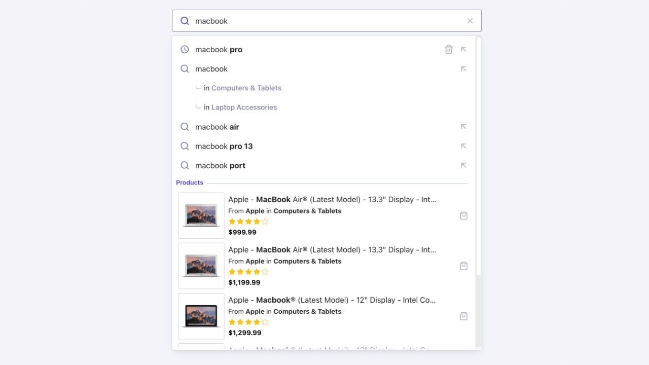
autocomplete widget lets you build an accessible, as-you-type autocomplete user interface that you can integrate anywhere on your site or app.
Open CodeSandbox
Run and edit the Autocomplete example in CodeSandbox.
Explore source code
Browse the source for the Autocomplete example on GitHub.
autocomplete widget in an existing or a new InstantSearch.js implementation to create this kind of experience.
Install InstantSearch.js
Theautocomplete widget is part of InstantSearch.js.
Install InstantSearch.js and the Algolia API client from the npm registry:
JavaScript
Add a container
The widget renders into a container element. Add one to your markup:HTML
div), not an input.
The widget generates a fully accessible search box for you.
Add the widget to InstantSearch
Unlike the standalone Autocomplete library, theautocomplete widget runs inside an InstantSearch instance.
Create the instance, add the widget with addWidgets, then start the search:
JavaScript
Display results from an index
Use theindices option to define which indices to query and how to display their results.
Each index can declare its own templates and a getURL function to navigate when a user selects an item:
JavaScript
indices array.
To learn more, see Including multiple result types.
Customize result templates
Each index renders with its ownheader, item, and noResults templates, and the widget accepts a top-level panel template for the overall layout.
The Display results from an index section covers header and item.
Highlight the matched query
Item templates receive acomponents object with Highlight, ReverseHighlight, Snippet, and ReverseSnippet helpers that emphasize the part of an attribute matching the user’s query:
JavaScript
Snippet to highlight within a longer, truncated attribute, and the Reverse variants to emphasize the text that doesn’t match.
This is a common style for Query Suggestions.
Show an empty state
ThenoResults template renders when an index returns nothing.
If any index defines it, the panel stays open even when every index is empty, so you can show a helpful message:
JavaScript
Customize the panel layout
The top-levelpanel template controls the layout of the whole panel, including the order and grouping of recent searches, query suggestions, and each index.
It receives an elements object whose keys are recent, suggestions, and each index’s indexName, so you can arrange sections into rows or columns—for example, suggestions on the left and results on the right:
JavaScript
CSS
Filter results
To narrow what an index returns, set Algolia search parameters on that index withsearchParameters.
You can apply filters, facetFilters, numericFilters, and other parameters per index:
JavaScript
Reshape and deduplicate results
UsetransformItems to adjust results before they’re displayed—for example, to remove duplicates across indices or limit the number of items each index shows.
The function receives an array with one entry per index, each shaped as { indexName, indexId, hits, results }, and must return the same shape:
JavaScript
Add Query Suggestions and recent searches
The widget can display query suggestions from a Query Suggestions index and recent searches stored in the browser’s local storage. Enable them withshowQuerySuggestions and showRecent:
JavaScript
Send click and conversion events
To send click and conversion events when users interact with the autocomplete, enableinsights on the InstantSearch instance:
JavaScript
add-to-cart, usually happen after the user leaves the autocomplete, on the destination page.
Send those where the conversion occurs with the Insights client.
The autocomplete item template doesn’t expose a sendEvent function.
Support keyboard navigation
The widget renders an accessible combobox, so users can operate it entirely from the keyboard—no extra configuration:- Up and Down arrows move through the items. The highlight wraps around at the ends of the list.
- Enter opens the highlighted item, or submits the typed query when nothing is highlighted.
- Escape closes the panel, then clears the highlight.
- Tab closes the panel and moves focus to the next element.
- If the highlighted item’s index defines
getURL, the browser opens that URL. - Otherwise, when you set
getSearchPageURL, submitting the query sends the user to your search results page. - To use client-side routing instead of a full page load, provide an
onSelectfunction and handle navigation in your app.
JavaScript
combobox, aria-expanded, aria-activedescendant), so screen readers announce the active item as users move through the list.
Enable detached (mobile) mode
On small screens, the widget can switch to a full-screen overlay. Use thedetachedMediaQuery option to control when this happens.
By default, detached mode activates at (max-width: 680px).
JavaScript
detachedMediaQuery to an empty string.
Explore advanced examples
- Federated two-column autocomplete: a layout that combines recent searches, Query Suggestions, product previews, a shortcuts panel, and category suggestions.
- Rich text box with mentions: a headless ”@” mentions text box, built with the
connectAutocompleteconnector, that reproduces the X compose experience.
See also
autocompletewidget reference for the full list of options.- Build a Query Suggestions UI.