> ## Documentation Index
> Fetch the complete documentation index at: https://www.algolia.com/llms.txt
> Use this file to discover all available pages before exploring further.

# Build your first agent

> Add an Agent Studio shopping assistant to your product search.

export const AlgoliaGenAI = () => <svg className="inline" width="20" height="20" viewBox="0 0 20 20" fill="none" xmlns="http://www.w3.org/2000/svg" ariaLabel="Algolia Generative AI" role="presentation">
    <path fill="#9698C3" d="M3.333 5h11.25v1.607H3.333zm0 3.214h9.643v1.607H3.333zm0 3.215h7.5v1.607h-7.5z"></path>
    <path d="m15.12 9.286-.684 2.076a.713.713 0 0 1-.455.455l-2.076.683 2.076.683a.715.715 0 0 1 .455.455l.683 2.076.683-2.076a.715.715 0 0 1 .455-.455l2.076-.683-2.076-.683a.715.715 0 0 1-.455-.455l-.683-2.076Z" fill="#36395A"></path>
  </svg>;

Add an Agent Studio shopping assistant to a product search app.

## Before you begin

Make sure you have:

* **An Algolia account**. [Create one for free](https://www.algolia.com/users/sign_up) if you don't already have one.
* **[Node.js](https://nodejs.org/en/download)** 20.19 or later.
* **[React InstantSearch](https://www.npmjs.com/package/react-instantsearch)** 7.34.0 or later.
  The `Chat` and `ChatTrigger` widgets require this version.
* **[instantsearch.css](https://www.npmjs.com/package/instantsearch.css)** 8.15.0 or later.
  Earlier versions don't include the chat and AI Mode button stylesheets.
* **An API key from a supported LLM provider**.
  For supported providers, see [LLM providers](/doc/guides/algolia-ai/agent-studio/how-to/llm-providers#supported-providers).

## Start from the product search app

This quickstart extends the [product search quickstart](/doc/guides/get-started/quickstart).
If you completed the quickstart,
open that project and skip to [Create your agent](#create-your-agent).
To build the app from scratch instead of downloading it,
follow the product search quickstart first, then return here.

<Steps>
  <Step title="Download the product search app">
    To download the app, run:

    ```sh icon=square-terminal theme={"system"}
    npx gitpick algolia/quickstarts/tree/main/product-search-react-typescript agent-studio-quickstart
    cd agent-studio-quickstart
    npm install
    ```
  </Step>

  <Step title="Add your Algolia credentials">
    In the Algolia dashboard, open the [**API Keys**](https://dashboard.algolia.com/account/api-keys) page and copy these values:

    * **Application ID**. Identifies your Algolia application.
    * **Write API key**. Used by the indexing script to update records and index settings.
    * **Search API key**. Used by the React app to query the index and call Agent Studio from the browser.

    Create a `.env.local` file and add the values to it:

    ```dotenv .env.local icon=lock-keyhole theme={"system"}
    VITE_ALGOLIA_APPLICATION_ID=
    ALGOLIA_WRITE_API_KEY=
    VITE_ALGOLIA_SEARCH_API_KEY=
    ```

    <Note>
      Keep your Write API key secret.
      Don't commit `.env.local` to version control or expose the write key in your app.
    </Note>
  </Step>

  <Step title="Index the sample products">
    Run the indexing script to create the `quickstart-products` index,
    add sample product records,
    and apply the index settings.

    ```sh icon=square-terminal theme={"system"}
    npm run index:products
    ```

    <Check>
      You should see `Successfully indexed and configured products.` in your terminal.
      In the Algolia dashboard, you can explore the `quickstart-products` index on the [**Browse**](https://dashboard.algolia.com/explorer/browse/quickstart-products) page.
    </Check>
  </Step>
</Steps>

## Create your agent

Create an agent that can search the `quickstart-products` index and answer shopping questions.

<Steps>
  <Step title="Open Agent Studio in the dashboard">
    1. In the Algolia dashboard, select your application.
    2. On the left sidebar, select <AlgoliaGenAI /> **Generative AI > Get started**.
    3. Under **Agent templates**, select **Shopping assistant**.
    4. On the **Shopping assistant** page, click **Start setup**.
  </Step>

  <Step title="Add an LLM provider">
    On the **Connect your agent to an LLM provider** page,
    select an existing provider or create a new one and enter the required credentials.
    For more information about supported providers and the required credentials,
    see [LLM providers](/doc/guides/algolia-ai/agent-studio/how-to/llm-providers).

    <Note>
      The **Algolia Sandbox** provider lets you test Agent Studio **in the dashboard only**.
      You need to use your own provider if you want to follow this quickstart.
    </Note>

    Click **Next: Data Access**.
  </Step>

  <Step title="Connect an index">
    On the **Define your agent's knowledge** page,
    select the `quickstart-products` index and click **Save**.
    Agent Studio automatically generates a description for the index.

    Click **Next: Prompt**.
  </Step>

  <Step title="Set up agent instructions">
    This quickstart uses the default template for a shopping assistant,
    with only a few adjustments.

    On the **Guide your agent's responses** page,
    replace the following placeholders in the template:

    * Replace `{{INSERT_BRAND}}` with `Algolia`
    * Replace `{{INSERT_INDUSTRY}}` with `fashion`
    * Replace `{{INSERT_LANGUAGE}}` with `English`
    * Feel free to delete the line with the `{{INSERT_COMPETITORS_LIST}}` placeholder.
      This quickstart doesn't need it, but leaving it in shouldn't cause any issues.

    Click **Next: Entry Points**.
  </Step>

  <Step title="Accept the default entry points, conversation features, and safety controls">
    1. On the **Configure how users find your agent** page,
       accept the defaults and click **Next: Conversation Features**.

    2. On the **Enhance your agent's conversations** page,
       accept the defaults and click **Next: Safety Controls**.

    3. On the **Protect your agent's usage** page,
       accept the defaults and click **Complete**.

    4. In the confirmation dialog, click **Start exploring**.
       This opens the agent's details page.
  </Step>

  <Step title="Test and publish your agent">
    On the agent's details page, you can change all settings,
    including the agent prompt and safety controls.
    You can also test your agent with a few queries.

    When you're ready to use the agent in your app, click **Publish**.
    In the confirmation dialog, click **View integration help**.
    Copy your agent ID.

    <Tip>
      You can also see the agent ID from the agent details view,
      by clicking on the <Icon icon="code" /> **Integration help** icon.
    </Tip>
  </Step>
</Steps>

## Add chat to the product search app

Add the React InstantSearch chat widgets to the existing product search app.

<Steps>
  <Step title="Optional: upgrade your dependencies">
    If you just downloaded the code with `npx gitpick`, you can skip this step.

    If you completed the product search quickstart a while ago,
    upgrade the InstantSearch libraries:

    ```sh icon=square-terminal theme={"system"}
    npm install react-instantsearch@latest instantsearch.css@latest
    ```

    The chat widgets require `react-instantsearch` 7.34.0 or later and `instantsearch.css` 8.15.0 or later.
  </Step>

  <Step title="Add your agent ID">
    Add your published agent ID to `.env.local`:

    ```dotenv .env.local icon=lock-keyhole theme={"system"}
    VITE_ALGOLIA_APPLICATION_ID=
    ALGOLIA_WRITE_API_KEY=
    VITE_ALGOLIA_SEARCH_API_KEY=
    VITE_ALGOLIA_AGENT_ID= # [!code ++]
    ```
  </Step>

  <Step title="Update the app">
    Replace `src/App.tsx` with the following code.
    The highlighted lines show changes to the product search app you prepared earlier.

    ```tsx src/App.tsx icon=code expandable theme={"system"}
    import { liteClient as algoliasearch } from "algoliasearch/lite";
    import type { Hit } from "instantsearch.js";
    import {
      Chat, // [!code ++]
      ChatTrigger, // [!code ++]
      Configure,
      Highlight,
      Hits,
      InstantSearch,
      Pagination,
      PoweredBy,
      RefinementList,
      SearchBox,
      Snippet,
    } from "react-instantsearch";
    import "instantsearch.css/themes/reset-min.css";
    import "instantsearch.css/components/chat-min.css"; // [!code ++]
    import "instantsearch.css/components/ai-mode-button.css"; // [!code ++]
    import "./App.css";

    const appId = import.meta.env.VITE_ALGOLIA_APPLICATION_ID;
    const apiKey = import.meta.env.VITE_ALGOLIA_SEARCH_API_KEY;
    const agentId = import.meta.env.VITE_ALGOLIA_AGENT_ID; // [!code ++]

    if (!appId) {
      console.error("Missing environment variable: VITE_ALGOLIA_APPLICATION_ID");
    }

    if (!apiKey) {
      console.error("Missing environment variable: VITE_ALGOLIA_SEARCH_API_KEY");
    }

    if (!agentId) { // [!code ++:3]
      console.error("Missing environment variable: VITE_ALGOLIA_AGENT_ID");
    }

    const searchClient = algoliasearch(appId, apiKey);

    type ProductRecord = {
      title: string;
      description: string;
      product_type: string;
      price: number;
      showcase_image: string;
    };

    type ProductHit = Hit<ProductRecord>;

    function SearchProductCard({ hit }: { hit: ProductHit }) { // [!code ++]
      return (
        <article className="product-card">
          <div className="product-card-image">
            <img src={hit.showcase_image} alt={hit.title} />
          </div>
          <div className="product-card-body">
            <p className="product-card-type">{hit.product_type}</p>
            <h2 className="product-card-title">
              <Highlight attribute="title" hit={hit} />
            </h2>
            <p className="product-card-description">
              <Snippet attribute="description" hit={hit} />
            </p>
            <p className="product-card-price">${hit.price}</p>
          </div>
        </article>
      );
    }

    function ChatProductCard({ item }: { item: ProductHit }) { // [!code ++:15]
      return (
        <article className="product-card">
          <div className="product-card-image">
            <img src={item.showcase_image} alt={item.title} />
          </div>
          <div className="product-card-body">
            <p className="product-card-type">{item.product_type}</p>
            <h2 className="product-card-title">{item.title}</h2>
            <p className="product-card-description">{item.description}</p>
            <p className="product-card-price">${item.price}</p>
          </div>
        </article>
      );
    }

    export default function App() {
      return (
        <InstantSearch indexName="quickstart-products" searchClient={searchClient}>
          <Configure hitsPerPage={12} />
          <div className="search-header">
            <SearchBox
              placeholder="Search products"
              aiMode // [!code ++]
            />
            <PoweredBy />
          </div>

          <div> {/* [!code ++:7] */}
            <Chat<ProductHit>
              agentId={agentId}
              feedback={true}
              itemComponent={ChatProductCard}
            />
          </div>

          <div className="search-body">
            <div className="filter-panel">
              <div className="filter-panel-section">
                <div className="filter-panel-section-title">Product type</div>
                <RefinementList attribute="product_type" sortBy={["count:desc"]} />
              </div>
            </div>

            <div className="search-results">
              <Hits<ProductRecord> hitComponent={SearchProductCard} /> {/* [!code ++] */}
              <Pagination />
            </div>
          </div>

          <ChatTrigger /> {/* [!code ++] */}
        </InstantSearch>
      );
    }
    ```

    Place `Chat` and `ChatTrigger` inside the same `InstantSearch` component as the search widgets.

    The product search app's single `ProductCard` becomes two components,
    because search results and agent responses provide different props:

    * `SearchProductCard` renders search results with highlighting and snippets.
      `Hits` passes each record as a `hit` prop.
    * `ChatProductCard` renders products returned by the agent's Algolia Search tool as plain text.
      The `itemComponent` prop of `Chat` passes each record as an `item` prop.
  </Step>

  <Step title="Update styles">
    Replace `src/App.css` with the following code.
    The highlighted lines show changes to the product search app you prepared earlier.

    ```css src/App.css icon="paintbrush" expandable theme={"system"}
    *,
    *::before,
    *::after {
      box-sizing: border-box;
    }

    :root {
      --color-text: #111827;
      --color-background: #ffffff;
      --color-border: #e5e7eb;
      --color-surface: #ffffff;
      --color-surface-muted: #f3f4f6;
      --color-muted: #6b7280;
      --color-accent: #5468ff;
      --color-accent-strong: #5468ff;
      --color-accent-ring: rgb(84 104 255 / 0.15);
      --color-error: #dc2626;
      --color-error-surface: #fef2f2;
      --color-error-ring: rgb(220 38 38 / 0.12);
    }

    body {
      margin: 0;
      font-family: system-ui, sans-serif;
      color: var(--color-text);
      background-color: var(--color-background);
    }

    #root {
      inline-size: min(100%, 70rem);
      margin-inline: auto;
      padding-block: 2rem;
      padding-inline: 1.25rem;
      color: inherit;
    }

    .search-header {
      display: grid;
      gap: 0.5rem;
      margin-block-end: 1.5rem;
    }

    .search-body {
      display: grid;
      grid-template-columns: 12.5rem minmax(0, 1fr);
      gap: 2rem;
    }

    .ais-SearchBox-input,
    .ais-Pagination-link {
      border: 1px solid var(--color-border);
      border-radius: 0.5rem;
      background-color: var(--color-surface);
    }

    .ais-SearchBox-input {
      inline-size: 100%;
      padding-block: 0.75rem;
      padding-inline: 1rem;
      font: inherit;
      font-size: 1rem;
      color: inherit;
      outline: none;
    }

    .ais-SearchBox-input:focus {
      border-color: var(--color-accent);
      box-shadow: 0 0 0 0.1875rem var(--color-accent-ring);
    }

    .ais-SearchBox-submit,
    .ais-SearchBox-reset {
      display: none;
    }

    .ais-RefinementList-list,
    .ais-Hits-list {
      margin: 0;
      padding: 0;
      list-style: none;
    }

    .ais-Hits-list {
      display: grid;
      grid-template-columns: repeat(auto-fill, minmax(12.5rem, 1fr));
      gap: 1rem;
    }

    .ais-Hits-item {
      display: flex;
    }

    .ais-Pagination-list {
      display: flex;
      flex-wrap: wrap;
      gap: 0.5rem;
      justify-content: center;
      padding-block: 0.75rem;
    }

    .ais-RefinementList-label {
      display: flex;
      align-items: center;
      gap: 0.5rem;
      font-size: 0.875rem;
    }

    .ais-PoweredBy,
    .ais-RefinementList-count,
    .product-card-type {
      font-size: 0.75rem;
      color: var(--color-muted);
    }

    .ais-PoweredBy {
      display: flex;
      align-items: center;
      min-block-size: 1.5rem;
      line-height: 1;
      justify-self: end;
    }

    .ais-PoweredBy-link {
      display: flex;
      align-items: center;
    }

    .ais-PoweredBy-text {
      line-height: 1;
    }

    .ais-RefinementList-list {
      display: grid;
      gap: 0.5rem;
    }

    .ais-RefinementList-count {
      margin-inline-start: auto;
    }

    .ais-RefinementList-checkbox {
      inline-size: 0.875rem;
      block-size: 0.875rem;
      accent-color: var(--color-accent);
    }

    .ais-RefinementList-item--selected .ais-RefinementList-label {
      font-weight: 500;
    }

    .ais-Pagination-link {
      display: block;
      padding-block: 0.5rem;
      padding-inline: 0.75rem;
      font-size: 0.875rem;
      color: inherit;
      text-decoration: none;
    }

    .ais-Pagination-item--selected .ais-Pagination-link {
      color: #fff;
      background: var(--color-accent-strong);
      border-color: var(--color-accent-strong);
    }

    .ais-Pagination-item--disabled .ais-Pagination-link {
      opacity: 0.4;
      pointer-events: none;
    }

    .product-card {
      display: flex;
      flex: 1;
      flex-direction: column;
      inline-size: 100%;
      overflow: hidden;
      border: 1px solid var(--color-border);
      border-radius: 0.75rem;
      background-color: var(--color-surface);
    }

    .product-card-image {
      aspect-ratio: 1;
      overflow: hidden;
      background: var(--color-surface-muted);
    }

    .product-card-image img {
      inline-size: 100%;
      block-size: 100%;
      object-fit: cover;
    }

    .product-card-body {
      display: flex;
      flex: 1;
      flex-direction: column;
      gap: 0.25rem;
      padding: 0.75rem;
    }

    .product-card-type {
      margin: 0;
      text-transform: uppercase;
      letter-spacing: 0.06em;
    }

    .product-card-title,
    .product-card-price,
    .filter-panel-section-title {
      margin: 0;
      font-size: 0.875rem;
      font-weight: 500;
    }

    .product-card-description {
      flex: 1;
      margin: 0;
      overflow: hidden;
      font-size: 0.875rem;
      line-height: 1.5;
      color: var(--color-muted);
      display: -webkit-box;
      -webkit-line-clamp: 3;
      line-clamp: 3;
      -webkit-box-orient: vertical;
    }

    .filter-panel-section {
      padding-block-end: 0.75rem;
    }

    .filter-panel-section-title {
      margin-block-end: 0.5rem;
    }

    @media (max-width: 800px) {
      #root {
        padding-block: 1.5rem;
        padding-inline: 1rem;
      }

      .search-body {
        grid-template-columns: 1fr;
        gap: 1.5rem;
      }
    }

    /* Agent Studio additions */
    .ais-SearchBox-form { /* [!code ++:3] */
      position: relative;
    }

    .ais-SearchBox-input { /* [!code ++:3] */
      padding-inline-end: 7rem;
    }

    .ais-AiModeButton { /* [!code ++:13] */
      position: absolute;
      inset-block-start: 50%;
      inset-inline-end: 0.5rem;
      transform: translateY(-50%);
      border-radius: 0.5rem;
      box-shadow: 0 0 0 0.1875rem transparent;
    }

    .ais-AiModeButton:focus-visible {
      outline: none;
      box-shadow: 0 0 0 0.1875rem var(--color-accent-ring);
    }

    @media (prefers-reduced-motion: reduce) { /* [!code ++:5] */
      .ais-ChatMessages-content--clearing {
        transition: opacity 1ms var(--ais-transition-timing-function) !important;
      }
    }

    body:has(.ais-ChatToggleButton--floating) .ais-ChatOverlayLayout--maximized { /* [!code ++:3] */
      height: calc(100% - var(--ais-chat-margin) * 2 - var(--ais-spacing) * 4);
    }

    .ais-ChatMessage-message .ais-Carousel-item { /* [!code ++:3] */
      display: flex;
    }

    .ais-Chat { /* [!code ++:3] */
      --ais-border-radius-lg: var(--ais-border-radius-sm);
    }
    ```
  </Step>

  <Step title="Test the chat">
    Start the development server:

    ```sh icon=square-terminal theme={"system"}
    npm run dev
    ```

    If the server was already running, restart it.
    Open [`http://localhost:5173`](http://localhost:5173).

    <Check>
      The app shows a product grid, a product type filter, and a search box with an **AI Mode** button.
      A floating chat button is in the lower corner.

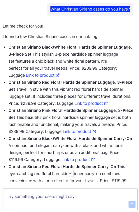
      Select **AI Mode** and ask questions, such as `Show polka dot pants` or `What should I wear to a wedding?`.
      The agent returns matching products from the `quickstart-products` index.
    </Check>
  </Step>
</Steps>

## Customize the assistant experience

<AccordionGroup>
  <Accordion title="Add a welcome message and prompt suggestions">
    Use `emptyComponent` to show a welcome message before the first chat message.
    Prompt suggestions help users start a conversation.

    Add the prompts and welcome component before the `App` component:

    ```tsx src/App.tsx icon=code expandable theme={"system"}
    const shoppingAssistantPrompts = [
      "Find me a summer wedding outfit",
      "What goes with wide-leg jeans?",
      "Show me floral skirts",
    ];

    function ShoppingAssistantWelcome({
      sendMessage,
      status,
    }: {
      sendMessage?: (params: { text: string }) => void;
      status?: string;
    }) {
      const disabled = status !== undefined && status !== "ready";

      return (
        <div className="ais-ChatGreeting">
          <h2 className="ais-ChatGreeting-heading">How can I help you shop today?</h2>
          <p className="ais-ChatGreeting-subheading">
            Ask for outfit ideas, product recommendations, sizing help, or style advice.
          </p>
          <div className="ais-ChatPromptSuggestions">
            {shoppingAssistantPrompts.map((prompt) => (
              <button
                className="ais-ChatPromptSuggestions-suggestion"
                disabled={disabled || !sendMessage}
                key={prompt}
                onClick={() => sendMessage?.({ text: prompt })}
                type="button"
              >
                {prompt}
              </button>
            ))}
          </div>
        </div>
      );
    }
    ```

    Pass `ShoppingAssistantWelcome` to the `Chat` component:

    ```tsx src/App.tsx icon=code theme={"system"}
    <Chat<ProductHit>
      agentId={agentId}
      emptyComponent={ShoppingAssistantWelcome} // [!code ++]
      feedback={true}
      itemComponent={ChatProductCard}
    />
    ```

    Add styles for the prompt suggestions to `src/App.css`:

    ```css src/App.css icon=paintbrush theme={"system"}
    .ais-ChatPromptSuggestions-suggestion {
      background-color: rgba(var(--ais-primary-color-rgb), 0.08);
      border: 1px solid rgba(var(--ais-primary-color-rgb), 0.3);
      color: rgba(var(--ais-primary-color-rgb), 1);
    }

    @media (hover: hover) {
      .ais-ChatPromptSuggestions-suggestion:hover:not(:disabled) {
        background-color: rgba(var(--ais-primary-color-rgb), 0.15);
        border-color: rgba(var(--ais-primary-color-rgb), 1);
      }
    }

    .ais-ChatPromptSuggestions-suggestion:active:not(:disabled) {
      background-color: rgba(var(--ais-primary-color-rgb), 0.2);
    }
    ```

    For more information, see [Customize the chat welcome screen](/doc/guides/building-search-ui/going-further/chat-customization/welcome-screen/react).
  </Accordion>

  <Accordion title="Customize button and chat labels">
    Use `translations` to change the AI Mode button label and chat title.

    ```tsx src/App.tsx icon=code theme={"system"}
    <SearchBox
      placeholder="Search products"
      aiMode
      translations={{ aiModeButtonTitle: "Ask assistant" }} // [!code ++]
    />

    <Chat<ProductHit>
      agentId={agentId}
      feedback={true}
      itemComponent={ChatProductCard}
      translations={{ // [!code ++:5]
        header: {
          title: "Shopping assistant",
        },
      }}
    />
    ```
  </Accordion>

  <Accordion title="Adjust token and rate limits">
    You set cost controls and rate limits during agent creation in the **Safety Controls** stage.
    You can adjust them anytime to manage LLM usage.
    Cost controls limit output tokens, conversation length, and the number of tool and reasoning loops.
    Rate limits restrict calls to the agent's `/completions` endpoint.

    For more information, see [Cost control](/doc/guides/algolia-ai/agent-studio/how-to/agent-configuration#cost-control) and [Rate limiting](/doc/guides/algolia-ai/agent-studio/how-to/agent-configuration#rate-limiting).
  </Accordion>
</AccordionGroup>

## What's next

* [Integrate Agent Studio](/doc/guides/algolia-ai/agent-studio/how-to/integration) to learn about API and frontend integrations.
* [Use tools in Agent Studio](/doc/guides/algolia-ai/agent-studio/how-to/tools/overview) to add search, client-side, or Model Context Protocol tools.
