> ## Documentation Index
> Fetch the complete documentation index at: https://algolia.com/llms.txt
> Use this file to discover all available pages before exploring further.
# Facet drop-down menus
> Learn how to display your facets as dropdowns with InstantSearch.js.
All Search and Discovery user interfaces display, in addition to a search box, a series of filters that allow users to narrow down their search.
These onscreen filters are called [facets](/doc/guides/managing-results/refine-results/faceting).
A typical facet is an attribute like "brand" or "price", and facet values are the individual brands and prices.
By clicking on a facet value, users can include and exclude whole categories of products.
For example, by selecting "Blue" in the "Color" facet filter, a user can exclude every product except blue ones.
For a long time, ecommerce websites have been displaying facets on the left side of the screen, providing direct access. But this placement reduces the space available to display products. With the rise of mobile-first design and touchscreen, online businesses have started to display facets at the top of their product listing.
That's the case of [Lacoste](https://www.lacoste.com/gb/polo-shirts/all-polo-shirts/#query=Polo) which [increased its sales by +150% sales with Algolia's search](https://resources.algolia.com/customer-stories/casestudy-lacoste-en).
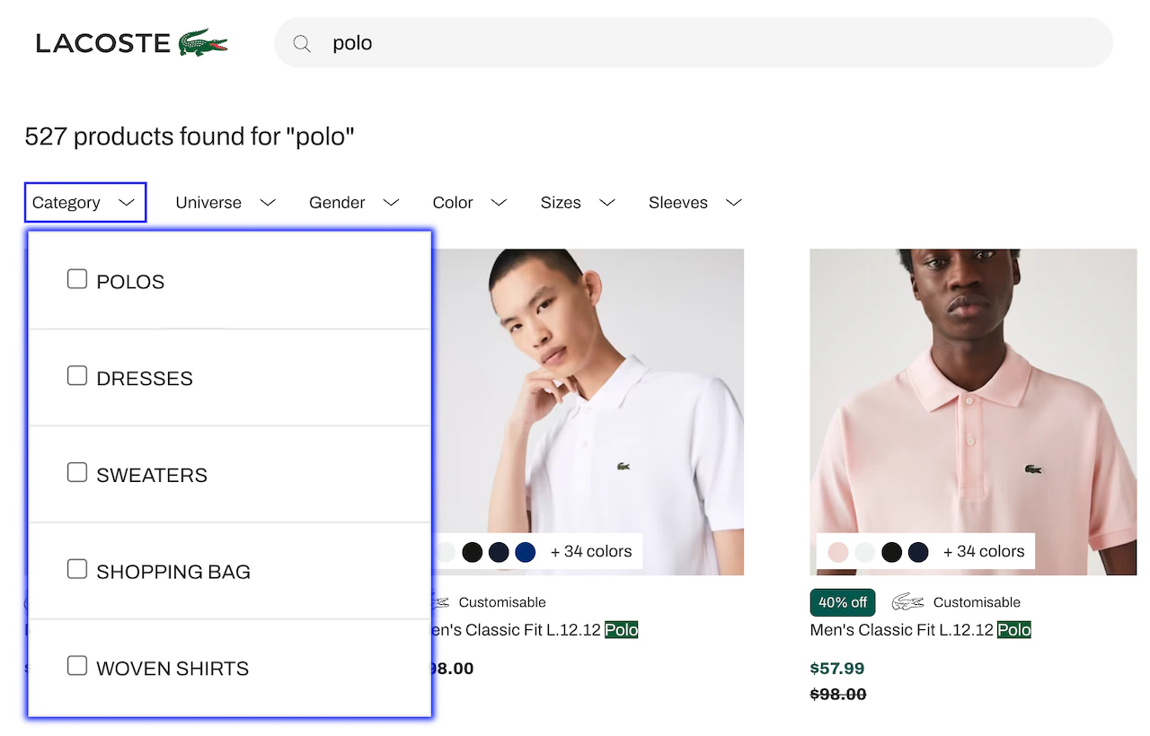 Dropdown faceting offers two benefits:
* It increases facet visibility and accessibility, encouraging more usage.
* It simplifies the screen, leaving more room for products and creating more on-screen breathing space, an important UX design choice.
This guide shows how to turn a facet filter, commonly represented by a [`refinementList`](/doc/api-reference/widgets/refinement-list/js) or a [`hierarchicalMenu`](/doc/api-reference/widgets/hierarchical-menu/js), widget, into a [custom widget](/doc/guides/building-search-ui/widgets/customize-an-existing-widget/js) with a drop-down menu layout.
The provided code uses InstantSearch.js, which can be taken as-is or as a reference if you want to replicate the same pattern using [Vue](/doc/guides/building-search-ui/what-is-instantsearch/vue) InstantSearch.
Run and edit the Facet drop-down menus example in CodeSandbox.
Browse the source for the Facet drop-down menus example on GitHub.
## Wrapper elements
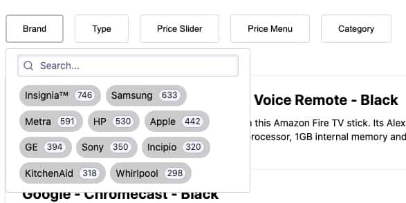
By design, each drop-down menu refinement widget wrapper has two elements:
* A button with a label and facet count
* A drop-down menu box
Both can be customized using [settings](#settings).
Each of the drop-down menu come wrapped in its own `div`,
which allows multiple facets in the same container, thus creating a horizontal list.
Dropdown faceting offers two benefits:
* It increases facet visibility and accessibility, encouraging more usage.
* It simplifies the screen, leaving more room for products and creating more on-screen breathing space, an important UX design choice.
This guide shows how to turn a facet filter, commonly represented by a [`refinementList`](/doc/api-reference/widgets/refinement-list/js) or a [`hierarchicalMenu`](/doc/api-reference/widgets/hierarchical-menu/js), widget, into a [custom widget](/doc/guides/building-search-ui/widgets/customize-an-existing-widget/js) with a drop-down menu layout.
The provided code uses InstantSearch.js, which can be taken as-is or as a reference if you want to replicate the same pattern using [Vue](/doc/guides/building-search-ui/what-is-instantsearch/vue) InstantSearch.
Run and edit the Facet drop-down menus example in CodeSandbox.
Browse the source for the Facet drop-down menus example on GitHub.
## Wrapper elements
By design, each drop-down menu refinement widget wrapper has two elements:
* A button with a label and facet count
* A drop-down menu box
Both can be customized using [settings](#settings).
Each of the drop-down menu come wrapped in its own `div`,
which allows multiple facets in the same container, thus creating a horizontal list.
 To ease the creation of a drop-down menu widget, this guide provides a factory wrapper function called `createDropdown` that takes two parameters:
* The refinement widget you want to turn into a drop-down menu
* An object for optional settings
This function, located in the [`src/Dropdown.js`](https://codesandbox.io/p/sandbox/github/algolia/doc-code-samples/tree/master/instantsearch.js/facet-dropdown?file=/src/Dropdown.js) file, returns an [InstantSearch widget](/doc/guides/building-search-ui/what-is-instantsearch/js#predefined-widgets) that can be placed alongside other widgets on your search screen.
All examples in this guide assume you've included InstantSearch.js in your web page from a CDN.
If you're using it with a package manager, adjust how you [import InstantSearch.js and its widgets](/doc/guides/building-search-ui/installation/js) for more information.
```js JavaScript icon=code theme={"system"}
const myFacetDropdown = createDropdown(instantsearch.widgets.refinementList, {
/* optional settings */
});
```
### Quickstart
First, you create your own drop-down menu widget.
Later, you customize it.
To create the drop-down menu, use a [`refinementList`](/doc/api-reference/widgets/refinement-list/js) widget on your `type` facet.
* Import all JavaScript files, such as Algolia search, InstantSearch.js, and your own JS files.
* Declare a placeholder `div` with the ID `type` for the drop-down menu widget for the `type` facet.
In [`index.html`](https://codesandbox.io/p/sandbox/github/algolia/doc-code-samples/tree/master/instantsearch.js/facet-dropdown?file=/index.html):
```html HTML icon=code-xml theme={"system"}
```
Import the `createDropdown` function from the [`src/dropdown.js`](https://codesandbox.io/p/sandbox/github/algolia/doc-code-samples/tree/master/instantsearch.js/facet-dropdown?file=/src/Dropdown.js)
file before initializing an InstantSearch instance with your Algolia credentials and create the drop-down menu widget.
In this case, use a [`refinementList`](/doc/api-reference/widgets/refinement-list/js) widget for the type facet.
As a result, you create a customized `refinementListDropdown` widget for the `type` facet that can also be re-used for other facets.
In [`src/app.js`](https://codesandbox.io/p/sandbox/github/algolia/doc-code-samples/tree/master/instantsearch.js/facet-dropdown?file=/src/app.js):
```js JavaScript icon=code theme={"system"}
import { createDropdown } from "./Dropdown";
// Create the refinementListDropdown widget
const refinementListDropdown = createDropdown(
instantsearch.widgets.refinementList,
{ closeOnChange: true },
);
```
Here, `instantsearch.widgets.refinementList` refers to InstantSearch's [`refinementList`](/doc/api-reference/widgets/refinement-list/js) widget. See the [widget reference guide](/doc/api-reference/widgets/refinement-list/js).
Now that you've created your `refinementListDropdown` widget, you're ready to add it to your InstantSearch instance.
```js JavaScript icon=code theme={"system"}
// Initialize InstantSearch and your widgets
search.addWidgets([
instantsearch.widgets.searchBox({
container: '#searchbox',
}),
instantsearch.widgets.hits({...}),
// Adding the refinementListDropdown widget on the `type` facet
refinementListDropdown({
container: '#type', // The CSS Selector of the DOM element inside which the widget is inserted.
attribute: 'type', // The name of the attribute in the records.
searchable: true // Whether to add a search input to let users search for more facet values.
}),
...
]);
search.start();
```
By design, the `createDropdown` function creates a widget that acts as a wrapper around the initial widget, which is passed as a parameter.
That's why the created `refinementListDropdown` widget can take any of the settings available in the `refinementList` widget.
For example, `{ limit: 5, showMore: true }` limits the default number of displayed facet values to "5".
To ease the creation of a drop-down menu widget, this guide provides a factory wrapper function called `createDropdown` that takes two parameters:
* The refinement widget you want to turn into a drop-down menu
* An object for optional settings
This function, located in the [`src/Dropdown.js`](https://codesandbox.io/p/sandbox/github/algolia/doc-code-samples/tree/master/instantsearch.js/facet-dropdown?file=/src/Dropdown.js) file, returns an [InstantSearch widget](/doc/guides/building-search-ui/what-is-instantsearch/js#predefined-widgets) that can be placed alongside other widgets on your search screen.
All examples in this guide assume you've included InstantSearch.js in your web page from a CDN.
If you're using it with a package manager, adjust how you [import InstantSearch.js and its widgets](/doc/guides/building-search-ui/installation/js) for more information.
```js JavaScript icon=code theme={"system"}
const myFacetDropdown = createDropdown(instantsearch.widgets.refinementList, {
/* optional settings */
});
```
### Quickstart
First, you create your own drop-down menu widget.
Later, you customize it.
To create the drop-down menu, use a [`refinementList`](/doc/api-reference/widgets/refinement-list/js) widget on your `type` facet.
* Import all JavaScript files, such as Algolia search, InstantSearch.js, and your own JS files.
* Declare a placeholder `div` with the ID `type` for the drop-down menu widget for the `type` facet.
In [`index.html`](https://codesandbox.io/p/sandbox/github/algolia/doc-code-samples/tree/master/instantsearch.js/facet-dropdown?file=/index.html):
```html HTML icon=code-xml theme={"system"}
```
Import the `createDropdown` function from the [`src/dropdown.js`](https://codesandbox.io/p/sandbox/github/algolia/doc-code-samples/tree/master/instantsearch.js/facet-dropdown?file=/src/Dropdown.js)
file before initializing an InstantSearch instance with your Algolia credentials and create the drop-down menu widget.
In this case, use a [`refinementList`](/doc/api-reference/widgets/refinement-list/js) widget for the type facet.
As a result, you create a customized `refinementListDropdown` widget for the `type` facet that can also be re-used for other facets.
In [`src/app.js`](https://codesandbox.io/p/sandbox/github/algolia/doc-code-samples/tree/master/instantsearch.js/facet-dropdown?file=/src/app.js):
```js JavaScript icon=code theme={"system"}
import { createDropdown } from "./Dropdown";
// Create the refinementListDropdown widget
const refinementListDropdown = createDropdown(
instantsearch.widgets.refinementList,
{ closeOnChange: true },
);
```
Here, `instantsearch.widgets.refinementList` refers to InstantSearch's [`refinementList`](/doc/api-reference/widgets/refinement-list/js) widget. See the [widget reference guide](/doc/api-reference/widgets/refinement-list/js).
Now that you've created your `refinementListDropdown` widget, you're ready to add it to your InstantSearch instance.
```js JavaScript icon=code theme={"system"}
// Initialize InstantSearch and your widgets
search.addWidgets([
instantsearch.widgets.searchBox({
container: '#searchbox',
}),
instantsearch.widgets.hits({...}),
// Adding the refinementListDropdown widget on the `type` facet
refinementListDropdown({
container: '#type', // The CSS Selector of the DOM element inside which the widget is inserted.
attribute: 'type', // The name of the attribute in the records.
searchable: true // Whether to add a search input to let users search for more facet values.
}),
...
]);
search.start();
```
By design, the `createDropdown` function creates a widget that acts as a wrapper around the initial widget, which is passed as a parameter.
That's why the created `refinementListDropdown` widget can take any of the settings available in the `refinementList` widget.
For example, `{ limit: 5, showMore: true }` limits the default number of displayed facet values to "5".
 ## Settings
The `createDropdown` function takes two parameters:
* Required: a refinement widget to turn into a drop-down menu
* Optional: an object with settings
```js JavaScript icon=code theme={"system"}
createDropdown(
baseWidget,
({ cssClasses, buttonText, buttonClassName, closeOnChange } = {}),
);
```
### `cssClasses`
**Type:** `object`
An object that lets you [override the CSS class](/doc/guides/building-search-ui/widgets/customize-an-existing-widget/js#style-your-widgets) in your code.
Here's an example with default values:
```js JavaScript icon=code theme={"system"}
cssClasses = {
root: "ais-Dropdown",
button: "ais-Dropdown-button",
buttonRefined: "ais-Dropdown-button--refined",
closeButton: "ais-Dropdown-close",
};
```
### `buttonText`
**Type:** `string | function`
This is the text displayed in the DropDown button.
It can be a string or a function.
By default, it shows the price of the active price refinement.
Here's an example from the `priceMenuDropdown` widget.
```js JavaScript icon=code theme={"system"}
buttonText({ items }) {
const refinedItem = (items || []).find(
(item) => item.label !== "All" && item.isRefined
);
return refinedItem ? `Price (${refinedItem.label})` : "Price menu";
},
```
### `buttonClassName`
**Type:** `string`
Same as `buttonText`, but for the button CSS class name.
Here's an example from the `priceMenuDropdown` widget.
```js JavaScript icon=code theme={"system"}
buttonClassName({ items }) {
const isRefined = (items || []).find(
(item) => item.label !== "All" && item.isRefined
);
return isRefined && "ais-Dropdown-button--refined";
},
```
### `closeOnChange`
**Type:** `boolean | function`
This argument can be a boolean or a function that returns `true` if you want the drop-down menu to close as soon as a user selects a value.
If it's `false`, it doesn't close automatically, thus enabling users to select more than one facet value.
Here's an example in which the code returns `true` if users are using a mobile device.
```js JavaScript icon=code theme={"system"}
const MOBILE_WIDTH = 375;
/* ... */
closeOnChange: () => window.innerWidth >= MOBILE_WIDTH;
```
## Customize the UI
The generated markup lets you customize the look and feel to your needs,
to change the default aspect of the drop-down menu with a few lines of CSS.
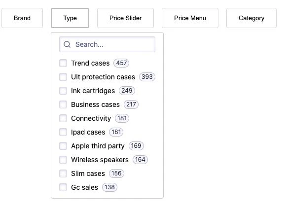
Here's the default version:
## Settings
The `createDropdown` function takes two parameters:
* Required: a refinement widget to turn into a drop-down menu
* Optional: an object with settings
```js JavaScript icon=code theme={"system"}
createDropdown(
baseWidget,
({ cssClasses, buttonText, buttonClassName, closeOnChange } = {}),
);
```
### `cssClasses`
**Type:** `object`
An object that lets you [override the CSS class](/doc/guides/building-search-ui/widgets/customize-an-existing-widget/js#style-your-widgets) in your code.
Here's an example with default values:
```js JavaScript icon=code theme={"system"}
cssClasses = {
root: "ais-Dropdown",
button: "ais-Dropdown-button",
buttonRefined: "ais-Dropdown-button--refined",
closeButton: "ais-Dropdown-close",
};
```
### `buttonText`
**Type:** `string | function`
This is the text displayed in the DropDown button.
It can be a string or a function.
By default, it shows the price of the active price refinement.
Here's an example from the `priceMenuDropdown` widget.
```js JavaScript icon=code theme={"system"}
buttonText({ items }) {
const refinedItem = (items || []).find(
(item) => item.label !== "All" && item.isRefined
);
return refinedItem ? `Price (${refinedItem.label})` : "Price menu";
},
```
### `buttonClassName`
**Type:** `string`
Same as `buttonText`, but for the button CSS class name.
Here's an example from the `priceMenuDropdown` widget.
```js JavaScript icon=code theme={"system"}
buttonClassName({ items }) {
const isRefined = (items || []).find(
(item) => item.label !== "All" && item.isRefined
);
return isRefined && "ais-Dropdown-button--refined";
},
```
### `closeOnChange`
**Type:** `boolean | function`
This argument can be a boolean or a function that returns `true` if you want the drop-down menu to close as soon as a user selects a value.
If it's `false`, it doesn't close automatically, thus enabling users to select more than one facet value.
Here's an example in which the code returns `true` if users are using a mobile device.
```js JavaScript icon=code theme={"system"}
const MOBILE_WIDTH = 375;
/* ... */
closeOnChange: () => window.innerWidth >= MOBILE_WIDTH;
```
## Customize the UI
The generated markup lets you customize the look and feel to your needs,
to change the default aspect of the drop-down menu with a few lines of CSS.
Here's the default version:
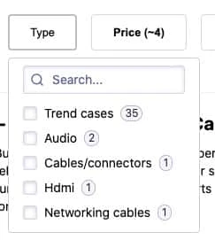 You can customize two aspects:
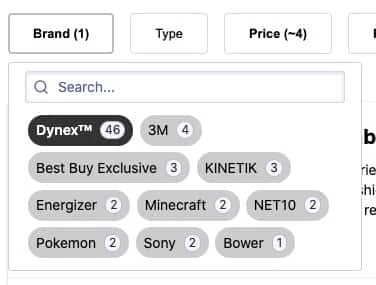
* **Inline facet values**
The `brandDropdown` widget uses an inline list.
See the code in `app.css`.
You can customize two aspects:
* **Inline facet values**
The `brandDropdown` widget uses an inline list.
See the code in `app.css`.
 ```css CSS icon=paintbrush theme={"system"}
.my-BrandDropdown .ais-RefinementList-list {
width: 20rem;
display: flex;
flex-wrap: wrap;
}
```
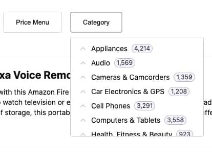
* **Fixed height drop-down menu**
The hierarchical `categoriesDropdown` widget uses a fixed height list.
See the code in `app.css`.
```css CSS icon=paintbrush theme={"system"}
.my-BrandDropdown .ais-RefinementList-list {
width: 20rem;
display: flex;
flex-wrap: wrap;
}
```
* **Fixed height drop-down menu**
The hierarchical `categoriesDropdown` widget uses a fixed height list.
See the code in `app.css`.
 ```css CSS icon=paintbrush theme={"system"}
#category .ais-HierarchicalMenu {
height: 195px;
overflow: auto;
}
```
## Mobile support
On mobile devices, more than anywhere else,
displaying facet refinements over the results is a must-have,
considering the limited real estate.
Drop-down widgets are a great fit,
but you need to tweak the display so they can take advantage of the screen's width and height.
```css CSS icon=paintbrush theme={"system"}
#category .ais-HierarchicalMenu {
height: 195px;
overflow: auto;
}
```
## Mobile support
On mobile devices, more than anywhere else,
displaying facet refinements over the results is a must-have,
considering the limited real estate.
Drop-down widgets are a great fit,
but you need to tweak the display so they can take advantage of the screen's width and height.
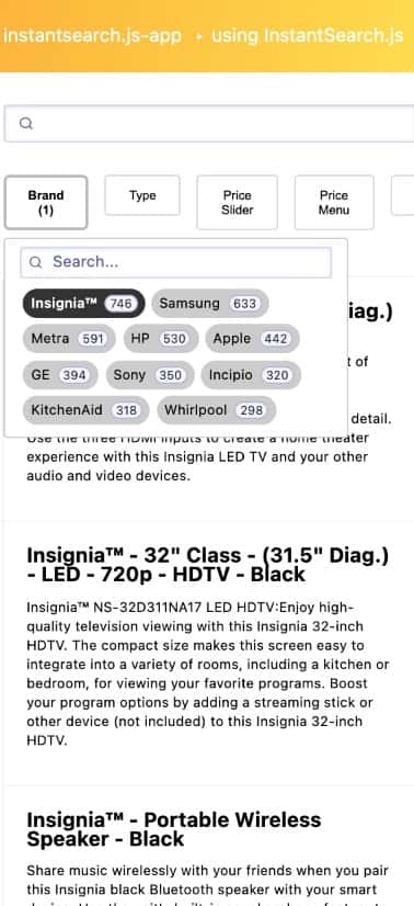 The mobile version uses the following CSS media query:
```css CSS icon=paintbrush theme={"system"}
@media only screen and (max-width: 375px) {
/* ... */
}
```
It uses the following JavaScript settings at each widget level:
```js JavaScript icon=code theme={"system"}
const MOBILE_WIDTH = 375;
const refinementListDropdown = createDropdown(
instantsearch.widgets.refinementList,
{ closeOnChange: () => window.innerWidth >= MOBILE_WIDTH },
);
```
This demo gets you started by providing a basic look and feel for mobile devices.
Refactor the provided code to match your current design and offer the best experience to your mobile users.
The mobile version uses the following CSS media query:
```css CSS icon=paintbrush theme={"system"}
@media only screen and (max-width: 375px) {
/* ... */
}
```
It uses the following JavaScript settings at each widget level:
```js JavaScript icon=code theme={"system"}
const MOBILE_WIDTH = 375;
const refinementListDropdown = createDropdown(
instantsearch.widgets.refinementList,
{ closeOnChange: () => window.innerWidth >= MOBILE_WIDTH },
);
```
This demo gets you started by providing a basic look and feel for mobile devices.
Refactor the provided code to match your current design and offer the best experience to your mobile users.