> ## Documentation Index
> Fetch the complete documentation index at: https://algolia.com/llms.txt
> Use this file to discover all available pages before exploring further.

# Create multi-column layouts

> Learn how to create a multi-column layout with Autocomplete.

export const Index = () => <Tooltip tip="An Algolia index is a searchable dataset that consists of records and configuration settings. These settings define how the records are searched and ranked.">
    index
  </Tooltip>;

<Tip>
  Autocomplete is also available as an experimental widget in InstantSearch,
  making it easier to integrate into your search experience.
  For more information,
  see the API reference for [InstantSearch.js](/doc/api-reference/widgets/autocomplete/js) or
  [React InstantSearch](/doc/api-reference/widgets/autocomplete/react).
</Tip>

Improving the search experience often means adding several sources of data, such as in a federated search.
Doing this in an organized and efficient way can be challenging.
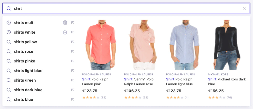
To make the most od larger display on devices such as desktops and tablets, you should display data in a multi-column layout. This lets users quickly browse search results and reduces scrolling.

<img src="https://mintcdn.com/algolia/Gja8rtqcY6eJARlr/images/ui-libraries/autocomplete/multi-column-layout.png?fit=max&auto=format&n=Gja8rtqcY6eJARlr&q=85&s=312cad785a7ae90072c8a1b605e179ab" alt="An experience using a two-column layout with Autocomplete" width="1046" height="454" data-path="images/ui-libraries/autocomplete/multi-column-layout.png" />

## Before you begin

This tutorial assumes the following requirements:

* An installation of the [`autocomplete-js`](/doc/ui-libraries/autocomplete/introduction/getting-started) package.
* A populated Query Suggestions <Index />.
  If you don't have one, [create it](/doc/guides/building-search-ui/ui-and-ux-patterns/query-suggestions/js):
  you can use the example application credentials and index provided in this tutorial.
* Existing HTML with an input element where you want to insert the autocomplete drop-down menu.
* Frontend development experience with HTML, CSS, and JavaScript.

## Starter code

This tutorial builds an Autocomplete app composed of two columns:

* A left column taking one third of the width which displays [recent searches and Query Suggestions](#add-recent-searches-and-query-suggestions)
* A right column taking up the rest of the space which [displays products](#display-products).

Create a file called `app.js` in your `src` directory and add this code to it:

```js JavaScript icon=code theme={"system"}
import { autocomplete } from "@algolia/autocomplete-js";

import "@algolia/autocomplete-theme-classic";

autocomplete({
  container: "#autocomplete",
  openOnFocus: true,
});
```

This starter code assumes you want to insert the autocomplete into a DOM element with `autocomplete` as an [`id`](https://developer.mozilla.org/en-US/docs/Web/HTML/Global_attributes/id).
Change the [`container`](/doc/ui-libraries/autocomplete/api-reference/autocomplete-js/autocomplete#param-container) to [match your markup](/doc/ui-libraries/autocomplete/core-concepts/basic-configuration-options).
Setting [`openOnFocus`](/doc/ui-libraries/autocomplete/api-reference/autocomplete-js/autocomplete#param-open-on-focus) to `true` ensures that the drop-down menu appears as soon as a user focuses the input.

## Two-column layout

With the [`render`](/doc/ui-libraries/autocomplete/api-reference/autocomplete-js/autocomplete#param-render) function of [`autocomplete-js`](/doc/ui-libraries/autocomplete/api-reference/autocomplete-js), you can customize the panel rendering to create two or more columns.

<CodeGroup>
  ```js JavaScript theme={"system"}
  import { autocomplete } from "@algolia/autocomplete-js";

  import "@algolia/autocomplete-theme-classic";

  autocomplete({
    container: "#autocomplete",
    openOnFocus: true,
    plugins: [],
    render({ render, html }, root) {
      render(
        html`<div class="aa-PanelLayout aa-Panel--scrollable">
          <div class="aa-PanelSections">
            <div class="aa-PanelSection--left"></div>
            <div class="aa-PanelSection--right"></div>
          </div>
        </div>`,
        root,
      );
    },
  });
  ```

  ```jsx JSX theme={"system"}
  /** @jsx h */
  import { autocomplete } from "@algolia/autocomplete-js";
  import { h, render } from "preact";

  import "@algolia/autocomplete-theme-classic";

  autocomplete({
    container: "#autocomplete",
    openOnFocus: true,
    plugins: [],
    render(params, root) {
      render(
        <div className="aa-PanelLayout aa-Panel--scrollable">
          <div className="aa-PanelSections">
            <div className="aa-PanelSection--left"></div>
            <div className="aa-PanelSection--right"></div>
          </div>
        </div>,
        root,
      );
    },
  });
  ```
</CodeGroup>

## Add recent searches and Query Suggestions

Add the [recent searches](/doc/ui-libraries/autocomplete/api-reference/autocomplete-plugin-recent-searches) (with a limit of two recent searches) and [Query Suggestions](/doc/ui-libraries/autocomplete/api-reference/autocomplete-plugin-query-suggestions) plugin (limiting the number of suggestions to seven) to the left column.
This gives a total of nine items in the right column.

Then, retrieve the recent searches and query suggestions plugins sources in the [`render`](/doc/ui-libraries/autocomplete/api-reference/autocomplete-js/autocomplete#param-render) function using `elements` and add it to the left column.

<CodeGroup>
  ```js JavaScript theme={"system"}
  // ...
  import { createLocalStorageRecentSearchesPlugin } from "@algolia/autocomplete-plugin-recent-searches";
  import { createQuerySuggestionsPlugin } from "@algolia/autocomplete-plugin-query-suggestions";
  import { liteClient as algoliasearch } from "algoliasearch/lite";

  import "@algolia/autocomplete-theme-classic";

  // You can use the example application credentials in case you don't have your own yet.
  // const appId = 'latency';
  // const apiKey = '6be0576ff61c053d5f9a3225e2a90f76';
  const searchClient = algoliasearch("YourApplicationID", "YourSearchOnlyAPIKey");

  const recentSearchesPlugin = createLocalStorageRecentSearchesPlugin({
    key: "multi-column-layout-example",
    limit: 2,
  });

  const querySuggestionsPlugin = createQuerySuggestionsPlugin({
    searchClient,
    indexName: "autocomplete_demo_products_query_suggestions",
    getSearchParams() {
      return {
        ...recentSearchesPlugin.data.getAlgoliaSearchParams(),
        hitsPerPage: 7,
      };
    },
  });

  autocomplete({
    container: "#autocomplete",
    openOnFocus: true,
    plugins: [recentSearchesPlugin, querySuggestionsPlugin],
    render({ elements, render, html }, root) {
      const { recentSearchesPlugin, querySuggestionsPlugin } = elements;

      render(
        html`<div class="aa-PanelLayout aa-Panel--scrollable">
          <div class="aa-PanelSections">
            <div class="aa-PanelSection--left">
              ${recentSearchesPlugin} ${querySuggestionsPlugin}
            </div>
            <div class="aa-PanelSection--right"></div>
          </div>
        </div>`,
        root,
      );
    },
  });
  ```

  ```jsx JSX theme={"system"}
  // ...
  import { createLocalStorageRecentSearchesPlugin } from "@algolia/autocomplete-plugin-recent-searches";
  import { createQuerySuggestionsPlugin } from "@algolia/autocomplete-plugin-query-suggestions";
  import { liteClient as algoliasearch } from "algoliasearch/lite";

  import "@algolia/autocomplete-theme-classic";

  const searchClient = algoliasearch("YourApplicationID", "YourSearchOnlyAPIKey");

  const recentSearchesPlugin = createLocalStorageRecentSearchesPlugin({
    key: "multi-column-layout-example",
    limit: 2,
  });

  const querySuggestionsPlugin = createQuerySuggestionsPlugin({
    searchClient,
    indexName: "autocomplete_demo_products_query_suggestions",
    getSearchParams() {
      return {
        ...recentSearchesPlugin.data.getAlgoliaSearchParams(),
        hitsPerPage: 7,
      };
    },
  });

  autocomplete({
    container: "#autocomplete",
    openOnFocus: true,
    plugins: [recentSearchesPlugin, querySuggestionsPlugin],
    render({ elements }, root) {
      const { recentSearchesPlugin, querySuggestionsPlugin } = elements;

      render(
        <div className="aa-PanelLayout aa-Panel--scrollable">
          <div className="aa-PanelSections">
            <div className="aa-PanelSection--left">
              {recentSearchesPlugin}
              {querySuggestionsPlugin}
            </div>
            <div className="aa-PanelSection--right"></div>
          </div>
        </div>,
        root,
      );
    },
  });
  ```
</CodeGroup>

## Create a "products" source

Add a source to retrieve and display the products in the right column.

Create a [dynamic source](/doc/ui-libraries/autocomplete/core-concepts/sources#dynamic-sources) using the [`getSources`](/doc/ui-libraries/autocomplete/api-reference/autocomplete-js/autocomplete#param-get-sources) function and retrieve the products from your Algolia index with the [`getAlgoliaResults`](/doc/ui-libraries/autocomplete/api-reference/autocomplete-js/getAlgoliaResults) function.

<CodeGroup>
  ```js JavaScript theme={"system"}
  // ...

  autocomplete({
    container: "#autocomplete",
    openOnFocus: true,
    plugins: [recentSearchesPlugin, querySuggestionsPlugin],
    getSources({ query }) {
      return [
        // ...
        {
          sourceId: "products",
          getItems() {
            return getAlgoliaResults({
              searchClient,
              queries: [
                {
                  indexName: "autocomplete_demo_products",
                  params: {
                    query,
                    hitsPerPage: 4,
                  },
                },
              ],
            });
          },
          // ...
        },
      ];
    },
    render({ elements, render, html }, root) {
      const { recentSearchesPlugin, querySuggestionsPlugin } = elements;

      render(
        html`<div class="aa-PanelLayout aa-Panel--scrollable">
          <div class="aa-PanelSections">
            <div class="aa-PanelSection--left">
              ${recentSearchesPlugin} ${querySuggestionsPlugin}
            </div>
            <div class="aa-PanelSection--right"></div>
          </div>
        </div>`,
        root,
      );
    },
  });
  ```

  ```jsx JSX theme={"system"}
  // ...

  autocomplete({
    container: "#autocomplete",
    openOnFocus: true,
    plugins: [recentSearchesPlugin, querySuggestionsPlugin],
    getSources({ query }) {
      return [
        // ...
        {
          sourceId: "products",
          getItems() {
            return getAlgoliaResults({
              searchClient,
              queries: [
                {
                  indexName: "autocomplete_demo_products",
                  params: {
                    query,
                    hitsPerPage: 4,
                  },
                },
              ],
            });
          },
          // ...
        },
      ];
    },
    render({ elements }, root) {
      const { recentSearchesPlugin, querySuggestionsPlugin } = elements;

      render(
        <div className="aa-PanelLayout aa-Panel--scrollable">
          <div className="aa-PanelSections">
            <div className="aa-PanelSection--left">
              {recentSearchesPlugin}
              {querySuggestionsPlugin}
            </div>
            <div className="aa-PanelSection--right"></div>
          </div>
        </div>,
        root,
      );
    },
  });
  ```
</CodeGroup>

## Display products

Now that you've set up your source,
you can display products with [templates](/doc/ui-libraries/autocomplete/core-concepts/templates).

### Create a product item component

Start by creating a file called `ProductItem.js` in your `src` directory,
then copy and paste the following code (a component used to render each item of your source):

<CodeGroup>
  ```js JavaScript theme={"system"}
  function cx(...classNames) {
    return classNames.filter(Boolean).join(" ");
  }

  function formatPrice(value, currency) {
    return value.toLocaleString("en-US", { style: "currency", currency });
  }

  export function ProductItem({ html, hit, components }) {
    return html`
      <a
        href="https://example.org/"
        target="_blank"
        rel="noreferrer noopener"
        class="${cx("aa-ItemLink", hit.objectID)}"
      >
        <div class="aa-ItemContent">
          <div class="aa-ItemPicture">
            <img
              src="${hit.image_urls[0]}"
              alt="${hit.name}"
              onLoad=${() => {
                const imgEl = document.querySelector(
                  `.${hit.objectID} .aa-ItemPicture`,
                );
                imgEl.classList.add("aa-ItemPicture--loaded");
              }}
            />
          </div>

          <div class="aa-ItemContentBody">
            <div>
              ${hit.brand &&
              html`
                <div class="aa-ItemContentBrand">
                  ${components.Highlight({ hit, attribute: "brand" })}
                </div>
              `}
              <div class="aa-ItemContentTitleWrapper">
                <div class="aa-ItemContentTitle">
                  ${components.Highlight({ hit, attribute: "name" })}
                </div>
              </div>
            </div>
            <div>
              <div class="aa-ItemContentPrice">
                <div class="aa-ItemContentPriceCurrent">
                  ${formatPrice(hit.price.value, hit.price.currency)}
                </div>
                ${hit.price.on_sales &&
                html`
                  <div class="aa-ItemContentPriceDiscounted">
                    ${formatPrice(hit.price.discounted_value, hit.price.currency)}
                  </div>
                `}
              </div>
              <div class="aa-ItemContentRating">
                <ul>
                  ${Array(5)
                    .fill(null)
                    .map(
                      (_, index) =>
                        html`<li key="${index}">
                          <div
                            class="${cx(
                              "aa-ItemIcon aa-ItemIcon--noBorder aa-StarIcon",
                              index >= hit.reviews.rating && "aa-StarIcon--muted",
                            )}"
                          >
                            <svg viewBox="0 0 24 24" fill="currentColor">
                              <path
                                d="M11.049 2.927c.3-.921 1.603-.921 1.902 0l1.519 4.674a1 1 0 00.95.69h4.915c.969 0 1.371 1.24.588 1.81l-3.976 2.888a1 1 0 00-.363 1.118l1.518 4.674c.3.922-.755 1.688-1.538 1.118l-3.976-2.888a1 1 0 00-1.176 0l-3.976 2.888c-.783.57-1.838-.197-1.538-1.118l1.518-4.674a1 1 0 00-.363-1.118l-3.976-2.888c-.784-.57-.38-1.81.588-1.81h4.914a1 1 0 00.951-.69l1.519-4.674z"
                              />
                            </svg>
                          </div>
                        </li>`,
                    )}
                </ul>
                <span class="aa-ItemContentRatingReviews">
                  (${hit.reviews.count})
                </span>
              </div>
            </div>
          </div>
        </div>
      </a>
    `;
  }
  ```

  ```jsx JSX theme={"system"}
  // ...
  import { useState } from "preact/hooks";

  function cx(...classNames) {
    return classNames.filter(Boolean).join(" ");
  }

  function formatPrice(value, currency) {
    return value.toLocaleString("en-US", { style: "currency", currency });
  }

  export function ProductItem({ hit, components }) {
    const [loaded, setLoaded] = useState(false);

    return (
      <a
        href="https://example.org/"
        target="_blank"
        rel="noreferrer noopener"
        className="aa-ItemLink"
      >
        <div className="aa-ItemContent">
          <div
            className={cx("aa-ItemPicture", loaded && "aa-ItemPicture--loaded")}
          >
            <img
              src={hit.image_urls[0]}
              alt={hit.name}
              onLoad={() => setLoaded(true)}
            />
          </div>

          <div className="aa-ItemContentBody">
            <div>
              {hit.brand && (
                <div className="aa-ItemContentBrand">
                  <components.Highlight hit={hit} attribute="brand" />
                </div>
              )}
              <div className="aa-ItemContentTitleWrapper">
                <div className="aa-ItemContentTitle">
                  <components.Highlight hit={hit} attribute="name" />
                </div>
              </div>
            </div>
            <div>
              <div className="aa-ItemContentPrice">
                <div className="aa-ItemContentPriceCurrent">
                  {formatPrice(hit.price.value, hit.price.currency)}
                </div>
                {hit.price.on_sales && (
                  <div className="aa-ItemContentPriceDiscounted">
                    {formatPrice(hit.price.discounted_value, hit.price.currency)}
                  </div>
                )}
              </div>
              <div className="aa-ItemContentRating">
                <ul>
                  {Array(5)
                    .fill(null)
                    .map((_, index) => (
                      <li key={index}>
                        <div
                          className={cx(
                            "aa-ItemIcon aa-ItemIcon--noBorder aa-StarIcon",
                            index >= hit.reviews.rating && "aa-StarIcon--muted",
                          )}
                        >
                          <svg viewBox="0 0 24 24" fill="currentColor">
                            <path d="M11.049 2.927c.3-.921 1.603-.921 1.902 0l1.519 4.674a1 1 0 00.95.69h4.915c.969 0 1.371 1.24.588 1.81l-3.976 2.888a1 1 0 00-.363 1.118l1.518 4.674c.3.922-.755 1.688-1.538 1.118l-3.976-2.888a1 1 0 00-1.176 0l-3.976 2.888c-.783.57-1.838-.197-1.538-1.118l1.518-4.674a1 1 0 00-.363-1.118l-3.976-2.888c-.784-.57-.38-1.81.588-1.81h4.914a1 1 0 00.951-.69l1.519-4.674z" />
                          </svg>
                        </div>
                      </li>
                    ))}
                </ul>
                <span className="aa-ItemContentRatingReviews">
                  ({hit.reviews.count})
                </span>
              </div>
            </div>
          </div>
        </div>
      </a>
    );
  }
  ```
</CodeGroup>

### Render each source item

To render each source item, use the [`templates`](/doc/ui-libraries/autocomplete/core-concepts/sources#param-templates) option in your source with the `item` function.

<CodeGroup>
  ```js JavaScript theme={"system"}
  // ...

  autocomplete({
    // ...
    getSources() {
      return [
        // ...
        {
          sourceId: 'products',
          getItems({ /_..._/ }) {
            // ...
          },
          templates: {
            item({ html, item, components }) {
              return ProductItem({ html, hit: item, components });
            },
          },
          // ...
        },
      ];
    },
    render({ elements, render, html }, root) {
      const { recentSearchesPlugin, querySuggestionsPlugin, products } = elements;

      render(
        html`<div class="aa-PanelLayout aa-Panel--scrollable">
          <div class="aa-PanelSections">
            <div class="aa-PanelSection aa-PanelSection--left">
              ${recentSearchesPlugin} ${querySuggestionsPlugin}
            </div>
            <div class="aa-PanelSection aa-PanelSection--right">
              ${products}
            </div>
          </div>
        </div>`,
        root
      );
    },
  });
  ```

  ```jsx JSX theme={"system"}
  // ...

  autocomplete({
    // ...
    getSources() {
      return [
        // ...
        {
          sourceId: "products",
          getItems(
            {
              /* ... */
            },
          ) {
            // ...
          },
          templates: {
            item({ html, item, components }) {
              return ProductItem({ html, hit: item, components });
            },
          },
          // ...
        },
      ];
    },
    render({ elements }, root) {
      const { recentSearchesPlugin, querySuggestionsPlugin, products } = elements;

      render(
        <div className="aa-PanelLayout aa-Panel--scrollable">
          <div className="aa-PanelSections">
            <div className="aa-PanelSection--left">
              {recentSearchesPlugin}
              {querySuggestionsPlugin}
            </div>
            <div className="aa-PanelSection--right">{products}</div>
          </div>
        </div>,
        root,
      );
    },
  });
  ```
</CodeGroup>

## Add styles

Copy and paste the following CSS snippet in your `src` directory and call it `style.css`.

```css CSS icon=paintbrush theme={"system"}
* {
  box-sizing: border-box;
}

body {
  background-color: rgb(244, 244, 249);
  color: rgb(65, 65, 65);
  font-family:
    -apple-system, BlinkMacSystemFont, "Segoe UI", "Roboto", "Oxygen", "Ubuntu",
    "Cantarell", "Fira Sans", "Droid Sans", "Helvetica Neue", sans-serif;
  -webkit-font-smoothing: antialiased;
  -moz-osx-font-smoothing: grayscale;
  padding: 1rem;
}

.container {
  margin: 0 auto;
  max-width: 1024px;
  width: 100%;
}

/* Panel section */
.aa-PanelSections {
  column-gap: var(--aa-spacing);
  display: flex;
}

.aa-PanelSection {
  display: flex;
  flex-direction: column;
}

.aa-PanelSection--left {
  width: 30%;
}

.aa-PanelSection--right {
  width: 70%;
}

/* Item */
.aa-ItemPicture {
  width: 100%;
  height: 100%;
  border-radius: 3px;
  overflow: hidden;
  background: rgba(var(--aa-muted-color-rgb), 0.2);
}

.aa-ItemPicture img {
  object-fit: cover;
  width: 100%;
  height: auto;
  opacity: 0;
  transition: opacity 0.2s ease-out;
}

.aa-ItemPicture--loaded img {
  opacity: 1;
}

/* Products */
/* --- Common */
.aa-Source[data-autocomplete-source-id="products"] .aa-List {
  display: grid;
  grid-template-columns: repeat(4, 1fr);
}

.aa-Source[data-autocomplete-source-id="products"] .aa-Item {
  padding: var(--aa-spacing-half);
}

.aa-Source[data-autocomplete-source-id="products"] .aa-ItemLink {
  justify-content: stretch;
  height: 100%;
}

/* --- Content */
.aa-Source[data-autocomplete-source-id="products"] .aa-ItemContent {
  display: flex;
  flex-direction: column;
  height: 100%;
}

.aa-Source[data-autocomplete-source-id="products"] .aa-ItemContent mark {
  color: rgb(var(--aa-primary-color-rgb));
}

.aa-Source[data-autocomplete-source-id="products"] .aa-ItemContentBody {
  width: 100%;
  display: flex;
  flex-direction: column;
  justify-content: space-between;
  gap: var(--aa-spacing-half);
}

/* --- Brand */
.aa-Source[data-autocomplete-source-id="products"] .aa-ItemContentBrand {
  font-size: 0.7em;
  text-transform: uppercase;
  color: rgb(var(--aa-muted-color-rgb));
  overflow: hidden;
  text-overflow: ellipsis;
  white-space: nowrap;
}

.aa-Source[data-autocomplete-source-id="products"] .aa-ItemContentBrand mark {
  font-weight: normal;
}

/* --- Title */
.aa-Source[data-autocomplete-source-id="products"] .aa-ItemContentTitleWrapper {
  height: calc(var(--aa-spacing) * 2.5);
}

.aa-Source[data-autocomplete-source-id="products"] .aa-ItemContentTitle {
  font-size: 0.9em;
  margin: 0;
  display: -webkit-box;
  -webkit-box-orient: vertical;
  -webkit-line-clamp: 2;
  white-space: normal;
}

/* --- Price */
.aa-Source[data-autocomplete-source-id="products"] .aa-ItemContentPrice {
  display: flex;
  column-gap: var(--aa-spacing-half);
}

.aa-Source[data-autocomplete-source-id="products"] .aa-ItemContentPriceCurrent {
  font-weight: bold;
}

.aa-Source[data-autocomplete-source-id="products"]
  .aa-ItemContentPriceDiscounted {
  font-size: 0.9em;
  text-decoration: line-through;
  color: rgb(var(--aa-muted-color-rgb));
}

/* --- Rating */
.aa-Source[data-autocomplete-source-id="products"] .aa-ItemContentRating ul {
  display: flex;
  list-style: none;
  padding: 0;
}

.aa-Source[data-autocomplete-source-id="products"] .aa-ItemContentRating {
  display: flex;
  align-items: center;
  column-gap: calc(var(--aa-spacing-half) / 2);
  margin-top: var(--aa-spacing-half);
}

.aa-Source[data-autocomplete-source-id="products"] .aa-StarIcon {
  width: 1.3em;
  height: 1.3em;
  color: #fdbc72;
}

.aa-Source[data-autocomplete-source-id="products"] .aa-StarIcon--muted {
  color: #d6d6e6;
}

.aa-Source[data-autocomplete-source-id="products"]
  .aa-ItemContentRatingReviews {
  font-size: 0.7em;
  color: #908eae;
}

/* Media queries */
@media screen and (max-width: 680px) {
  /* Panel section */
  .aa-PanelSections {
    flex-direction: column;
    row-gap: var(--aa-spacing);
  }

  .aa-PanelSection--left,
  .aa-PanelSection--right {
    width: 100%;
  }

  /* Products */
  .aa-Source[data-autocomplete-source-id="products"] .aa-List {
    display: flex;
    flex-wrap: wrap;
    gap: var(--aa-spacing-half);
  }

  .aa-Source[data-autocomplete-source-id="products"] .aa-Item {
    width: calc(50% - var(--aa-spacing-half) / 2);
  }
}
```

Make sure to include it in your project's `app.js` file.

```js JavaScript icon=code theme={"system"}
// ...

import "./style.css";

autocomplete({
  // ...
});
```

## Next steps

This tutorial focuses on building a multi-column layout but you can improve it by:

* Adding more [sources](/doc/ui-libraries/autocomplete/core-concepts/sources)
* [Reshaping](/doc/ui-libraries/autocomplete/guides/reshaping-sources) and combine your sources
* Adding [no-result states](/doc/ui-libraries/autocomplete/guides/implementing-multiple-search-states)

For an example, this [two-column layout](https://github.com/algolia/autocomplete/tree/next/examples/two-column-layout) implements these features.
