> ## Documentation Index
> Fetch the complete documentation index at: https://algolia.com/llms.txt
> Use this file to discover all available pages before exploring further.

# Create a custom renderer in React

> Learn how to build a full Autocomplete UI using React.

export const Index = () => <Tooltip tip="An Algolia index is a searchable dataset that consists of records and configuration settings. These settings define how the records are searched and ranked.">
    index
  </Tooltip>;

<Tip>
  Autocomplete is also available as an experimental widget in InstantSearch,
  making it easier to integrate into your search experience.
  For more information,
  see the API reference for [InstantSearch.js](/doc/api-reference/widgets/autocomplete/js) or
  [React InstantSearch](/doc/api-reference/widgets/autocomplete/react).
</Tip>

The [`autocomplete-js`](/doc/ui-libraries/autocomplete/api-reference/autocomplete-js) package includes everything you need to render a search experience and bind it to [your framework](/doc/ui-libraries/autocomplete/api-reference/autocomplete-js/autocomplete/#param-renderer).
Use the [`autocomplete-core`](/doc/ui-libraries/autocomplete/api-reference/autocomplete-core) package to build a custom UI that differs from the `autocomplete-js` output.

<Note>
  You might not need a custom renderer.
  Building a custom renderer is an advanced pattern that uses the [`autocomplete-core`](/doc/ui-libraries/autocomplete/api-reference/autocomplete-core) package to fully control the rendered experience.
  Don't use it unless you've reached limitations with [`autocomplete-js`](/doc/ui-libraries/autocomplete/api-reference/autocomplete-js) and its templating capabilities.
</Note>

## Import the package

Begin by importing [`createAutocomplete`](/doc/ui-libraries/autocomplete/api-reference/autocomplete-core/createAutocomplete) from the [core package](/doc/ui-libraries/autocomplete/api-reference/autocomplete-core) and [`getAlgoliaResults`](/doc/ui-libraries/autocomplete/api-reference/autocomplete-preset-algolia/getAlgoliaResults) from the [Algolia preset](/doc/ui-libraries/autocomplete/api-reference/autocomplete-preset-algolia/getAlgoliaResults).
The preset function [`autocomplete-preset-algolia`](/doc/ui-libraries/autocomplete/api-reference/autocomplete-preset-algolia) retrieves items from an Algolia <Index />.

```js JavaScript icon=code theme={"system"}
import { liteClient as algoliasearch } from "algoliasearch/lite";
import { createAutocomplete } from "@algolia/autocomplete-core";
import { getAlgoliaResults } from "@algolia/autocomplete-preset-algolia";

// ...
```

## Initialize Autocomplete

The Autocomplete entry point is the [`createAutocomplete`](/doc/ui-libraries/autocomplete/api-reference/autocomplete-core/createAutocomplete) function, which returns the methods to create the search experience.

```js JavaScript icon=code theme={"system"}
const searchClient = algoliasearch(
  "latency",
  "6be0576ff61c053d5f9a3225e2a90f76",
);

function Autocomplete() {
  // (1) Create a React state.
  const [autocompleteState, setAutocompleteState] = React.useState({});
  const autocomplete = React.useMemo(
    () =>
      createAutocomplete({
        onStateChange({ state }) {
          // (2) Synchronize the Autocomplete state with the React state.
          setAutocompleteState(state);
        },
        getSources() {
          return [
            // (3) Use an Algolia index source.
            {
              sourceId: "products",
              getItemInputValue({ item }) {
                return item.query;
              },
              getItems({ query }) {
                return getAlgoliaResults({
                  searchClient,
                  queries: [
                    {
                      indexName: "instant_search",
                      params: {
                        query,
                        hitsPerPage: 4,
                        highlightPreTag: "<mark>",
                        highlightPostTag: "</mark>",
                      },
                    },
                  ],
                });
              },
              getItemUrl({ item }) {
                return item.url;
              },
            },
          ];
        },
      }),
    [],
  );

  // ...
}
```

* Use a React state for the Autocomplete component to re-render when the [Autocomplete state](/doc/ui-libraries/autocomplete/core-concepts/state) changes.
* Listen to all Autocomplete state changes to synchronize them with the React state.
* This example uses an Algolia index as a [source](/doc/ui-libraries/autocomplete/core-concepts/sources).

This setup gives you access to all the methods you may want to use in the `autocomplete` variable in your React components.

## Use prop getters

Prop getters are methods that return props to use in your components.
These props contain accessibility features, event handlers, and so on.
They help create a complete experience without exposing their underlying technical elements.

The following snippet shows how to use the
`getRootProps()`,
`getInputProps()`,
`getPanelProps()`,
`getListProps()`,
and `getItemProps()`
[prop getters](/doc/ui-libraries/autocomplete/api-reference/autocomplete-core/createAutocomplete#returns) in the appropriate elements.

```jsx JSX icon=code theme={"system"}
function Autocomplete() {
  // ...

  return (
    <div className="aa-Autocomplete" {...autocomplete.getRootProps({})}>
      <input className="aa-Input" {...autocomplete.getInputProps({})} />
      <div className="aa-Panel" {...autocomplete.getPanelProps({})}>
        {autocompleteState.isOpen &&
          autocompleteState.collections.map((collection, index) => {
            const { source, items } = collection;

            return (
              <div key={`source-${index}`} className="aa-Source">
                {items.length > 0 && (
                  <ul className="aa-List" {...autocomplete.getListProps()}>
                    {items.map((item) => (
                      <li
                        key={item.objectID}
                        className="aa-Item"
                        {...autocomplete.getItemProps({
                          item,
                          source,
                        })}
                      >
                        {item.name}
                      </li>
                    ))}
                  </ul>
                )}
              </div>
            );
          })}
      </div>
    </div>
  );
}
```

The preceding code demonstrates that you don't need to worry about keyboard events, or tracking which item is active.
Autocomplete handles this under the hood with its prop getters.

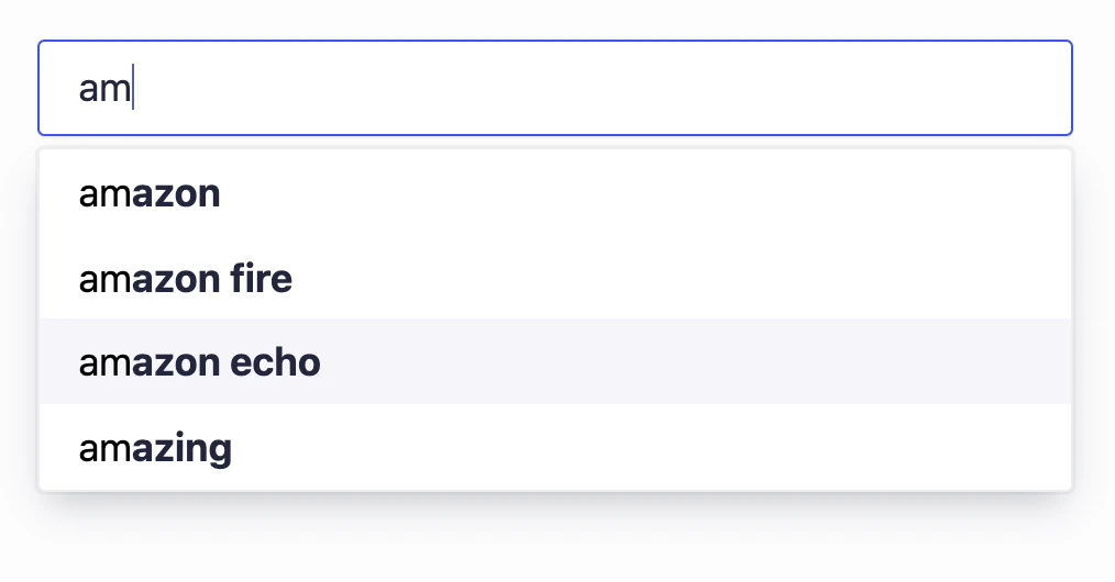
At this point, you should already have a usable search box:

<img src="https://mintcdn.com/algolia/Gja8rtqcY6eJARlr/images/ui-libraries/autocomplete/guides/autocomplete-input.png?fit=max&auto=format&n=Gja8rtqcY6eJARlr&q=85&s=f12c7e56bc7899f4fcbb5c234e8a916f" alt="Screenshot of an autocomplete input showing the text 'am' with suggestions 'amazon', 'amazon fire', 'amazon echo', and 'amazing'." width="1014" height="530" data-path="images/ui-libraries/autocomplete/guides/autocomplete-input.png" />

## Improve input accessibility

To improve the `input` control, wrap it in a `form` and apply the form props given by Autocomplete:

```jsx JSX icon=code theme={"system"}
function Autocomplete() {
  // ...
  const inputRef = React.useRef(null);

  return (
    <div className="aa-Autocomplete" {...autocomplete.getRootProps({})}>
      <form
        className="aa-Form"
        {...autocomplete.getFormProps({ inputElement: inputRef.current })}
      >
        <input ref={inputRef} {...autocomplete.getInputProps({})} />
      </form>
      {/* ... */}
    </div>
  );
}
```

The `getFormProps` prop getter handles submit and reset events.
It also respectively blurs and focuses the input when these events happen.
Pass the `inputElement` when calling `getFormProps` to use these features.

Add a label that represents the input and use the `getLabelProps` prop getter:

```jsx JSX icon=code theme={"system"}
function Autocomplete() {
  // ...
  const inputRef = React.useRef(null);

  return (
    <div className="aa-Autocomplete" {...autocomplete.getRootProps({})}>
      <form
        className="aa-Form"
        {...autocomplete.getFormProps({ inputElement: inputRef.current })}
      >
        <div className="aa-InputWrapperPrefix">
          <label className="aa-Label" {...autocomplete.getLabelProps({})}>
            Search
          </label>
        </div>
        <div className="aa-InputWrapper">
          <input
            className="aa-Input"
            ref={inputRef}
            {...autocomplete.getInputProps({})}
          />
        </div>
      </form>
      {/* ... */}
    </div>
  );
}
```

Another good practice for search inputs is to display a reset button.
Display it if there's a query.

```jsx JSX icon=code theme={"system"}
function Autocomplete() {
  // ...

  return (
    <div className="aa-Autocomplete" {...autocomplete.getRootProps({})}>
      <form
        className="aa-Form"
        {...autocomplete.getFormProps({ inputElement: inputRef.current })}
      >
        <div className="aa-InputWrapperPrefix">
          <label className="aa-Label" {...autocomplete.getLabelProps({})}>
            Search
          </label>
        </div>
        <div className="aa-InputWrapper">
          <input
            className="aa-Input"
            ref={inputRef}
            {...autocomplete.getInputProps({})}
          />
        </div>
        <div className="aa-InputWrapperSuffix">
          <button className="aa-ClearButton">ｘ</button>
        </div>
      </form>
      {/* ... */}
    </div>
  );
}
```

## Check network status

Displaying UI hints when the network is unstable helps users understand why results aren't updating in real-time.
Examine the [`status`](/doc/ui-libraries/autocomplete/core-concepts/state#param-status) to determine this:

```jsx JSX icon=code theme={"system"}
function Autocomplete() {
  // ...

  return (
    <div className="aa-Autocomplete" {...autocomplete.getRootProps({})}>
      {/* ... */}

      {autocompleteState.isOpen && (
        <div
          className={[
            "aa-Panel",
            autocompleteState.status === "stalled" && "aa-Panel--stalled",
          ]
            .filter(Boolean)
            .join(" ")}
          {...autocomplete.getPanelProps({})}
        >
          {/* ... */}
        </div>
      )}
      {/* ... */}
    </div>
  );
}
```

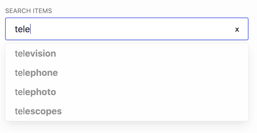
You could, for example, create a `.aa-Panel--stalled` CSS class that lowers items' opacity to show that search is temporarily stuck or unavailable.

<img src="https://mintcdn.com/algolia/Gja8rtqcY6eJARlr/images/ui-libraries/autocomplete/guides/search-unavailable.png?fit=max&auto=format&n=Gja8rtqcY6eJARlr&q=85&s=f1d480e701e04653b3d9a28065eae8cd" alt="Screenshot of a search input with a partial query typed, showing suggestions like television, telephone, telephoto, and telescopes." width="904" height="470" data-path="images/ui-libraries/autocomplete/guides/search-unavailable.png" />

For more information, see [Controlling behavior with state](/doc/ui-libraries/autocomplete/core-concepts/state).

## Mirror a native mobile experience

Native platforms offer better primitives for mobile search experiences.
Autocomplete helps provide these capabilities so that the web mobile experience is closer to the native mobile experience.

A common feature in mobile native experiences is to close the virtual keyboard when users start scrolling.
By automatically hiding the keyboard, you make it simpler for users to discover search results.
The panel closes when users tap outside it.

The `getEnvironmentProps` method returns event handlers that let you create this experience:

```jsx JSX icon=code theme={"system"}
function Autocomplete() {
  // ...

  const inputRef = React.useRef(null);
  const formRef = React.useRef(null);
  const panelRef = React.useRef(null);

  const { getEnvironmentProps } = autocomplete;

  React.useEffect(() => {
    if (!(formRef.current && panelRef.current && inputRef.current)) {
      return;
    }

    const { onTouchStart, onTouchMove, onMouseDown } = getEnvironmentProps({
      formElement: formRef.current,
      panelElement: panelRef.current,
      inputElement: inputRef.current,
    });

    window.addEventListener("touchstart", onTouchStart);
    window.addEventListener("touchmove", onTouchMove);
    window.addEventListener("mousedown", onMouseDown);

    return () => {
      window.removeEventListener("touchstart", onTouchStart);
      window.removeEventListener("touchmove", onTouchMove);
      window.removeEventListener("mousedown", onMouseDown);
    };
  }, [getEnvironmentProps, autocompleteState.isOpen]);

  return (
    <div className="aa-Autocomplete" {...autocomplete.getRootProps({})}>
      <form
        ref={formRef}
        className="aa-Form"
        {...autocomplete.getFormProps({ inputElement: inputRef.current })}
      >
        {/* ... */}
      </form>

      {autocompleteState.isOpen && (
        <div
          ref={panelRef}
          className={[
            "aa-Panel",
            autocompleteState.status === "stalled" && "aa-Panel--stalled",
          ]
            .filter(Boolean)
            .join(" ")}
          {...autocomplete.getPanelProps({})}
        >
          {/* ... */}
        </div>
      )}
    </div>
  );
}
```

This makes the app feel more familiar to mobile users.

## Help and discussion

You now have enough knowledge to build your own experience based on Autocomplete.
If you find that some topics weren't covered,
feel free to [open an issue](https://github.com/algolia/autocomplete/issues/new).
