> ## Documentation Index
> Fetch the complete documentation index at: https://algolia.com/llms.txt
> Use this file to discover all available pages before exploring further.

# Federated two-column autocomplete

> Build a two-column autocomplete with recent searches, Query Suggestions, and product previews.

export const customLabel_0 = undefined

<div className="not-prose algolia-flavor-switcher">
  <div className="afs-dropdown">
    <div className="afs-trigger" role="button" tabIndex="0" aria-haspopup="listbox">
      <span className="afs-current">React</span>

      <svg className="afs-chevron lucide lucide-chevron-down" width="24" height="24" viewBox="0 0 24 24" fill="none" stroke="currentColor" strokeWidth="2" strokeLinecap="round" strokeLinejoin="round" aria-hidden="true">
        <path d="m6 9 6 6 6-6" />
      </svg>
    </div>

    <ul className="afs-menu" role="listbox">
      <li role="option" aria-selected="false"><a className="afs-option" href="/doc/guides/building-search-ui/ui-and-ux-patterns/autocomplete/examples/federated/js"><span className="afs-option-name">JavaScript</span><span className="afs-option-lib">InstantSearch.js</span></a></li>
      <li role="option" aria-selected="true"><a className="afs-option is-current" href="/doc/guides/building-search-ui/ui-and-ux-patterns/autocomplete/examples/federated/react"><span className="afs-option-name">React</span><span className="afs-option-lib">React InstantSearch</span></a></li>
    </ul>
  </div>
</div>

This example builds on the [`<Autocomplete>`](/doc/guides/building-search-ui/ui-and-ux-patterns/autocomplete/react) widget guide.
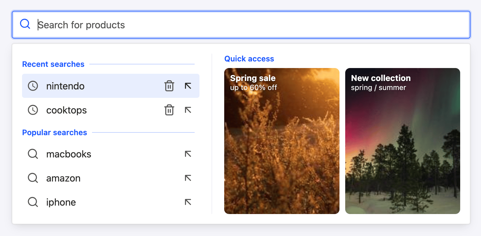
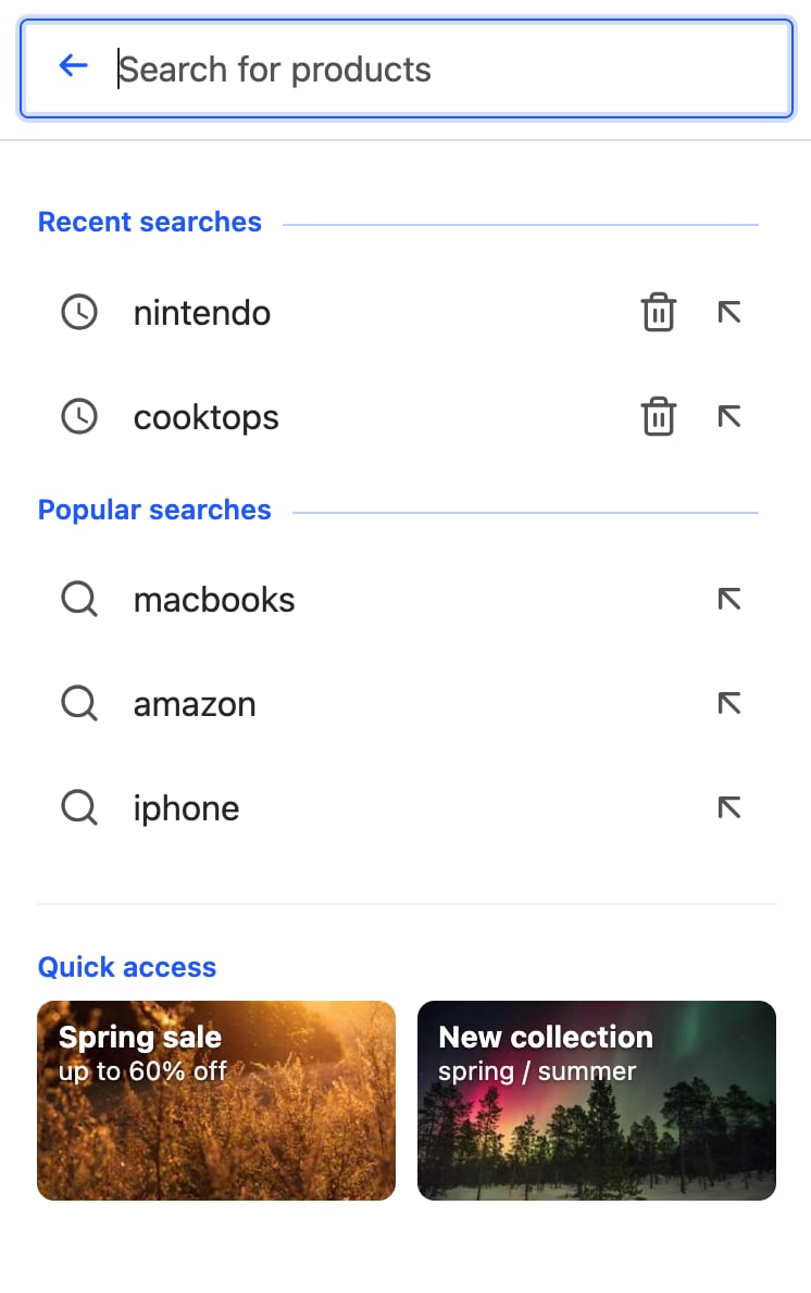
It creates a federated autocomplete experience with recent searches and Query Suggestions on the left, and product previews on the right.

<Callout icon="flask-conical" color="#14b8a6">
  This widget is **{customLabel_0 || "experimental"}** and is subject to change in minor versions.
</Callout>

<Tabs>
  <Tab title="Desktop">
    <img src="https://mintcdn.com/algolia/nyJ2KZzw6bfBNB-S/images/autocomplete/widget-federated-desktop.png?fit=max&auto=format&n=nyJ2KZzw6bfBNB-S&q=85&s=df2d4d6d04ddbc1bbe73f4209b961eb2" alt="Federated autocomplete with recent searches and Query Suggestions on the left and product previews on the right (desktop)" width="1594" height="784" data-path="images/autocomplete/widget-federated-desktop.png" />
  </Tab>

  <Tab title="Mobile">
    <img src="https://mintcdn.com/algolia/nyJ2KZzw6bfBNB-S/images/autocomplete/widget-federated-mobile.png?fit=max&auto=format&n=nyJ2KZzw6bfBNB-S&q=85&s=66f7874dc3a81a2c863b22cbf05e7a33" alt="Federated autocomplete in detached mode on a narrow screen (mobile)" style={{ maxWidth: "280px" }} className="no-shadow" width="746" height="1190" data-path="images/autocomplete/widget-federated-mobile.png" />
  </Tab>
</Tabs>

<Columns>
  <Card title="Open CodeSandbox" icon="codesandbox" href="https://codesandbox.io/s/github/algolia/doc-code-samples/tree/master/react-instantsearch/autocomplete">
    Run and edit the federated autocomplete example in CodeSandbox.
  </Card>

  <Card title="Explore source code" icon="github" href="https://github.com/algolia/doc-code-samples/tree/master/react-instantsearch/autocomplete">
    Browse the source code for the federated autocomplete example on GitHub.
  </Card>
</Columns>

The `panelComponent` arranges the sources into two columns, and each source brings its own header and item components:

```jsx React icon=code expandable theme={"system"}
import { liteClient as algoliasearch } from "algoliasearch/lite";
import {
  InstantSearch,
  EXPERIMENTAL_Autocomplete,
  Highlight,
} from "react-instantsearch";

import "instantsearch.css/themes/satellite.css";

const searchClient = algoliasearch(
  "latency",
  "6be0576ff61c053d5f9a3225e2a90f76",
);

// Right column: product previews with image, name, price, and highlight
function ProductItem({ item }) {
  return (
    <div className="demo-product">
      <div className="demo-product-image">
        <img src={item.image} alt={item.name} />
      </div>
      <div>
        <p className="demo-product-name">
          <Highlight hit={item} attribute="name" />
        </p>
        <p className="demo-product-meta">
          {item.brand} · ${item.price}
        </p>
      </div>
    </div>
  );
}

export function App() {
  return (
    <InstantSearch indexName="instant_search" searchClient={searchClient}>
      <EXPERIMENTAL_Autocomplete
        placeholder="Search for products"
        // Left column, top: recent searches from local storage
        showRecent={{
          headerComponent: () => (
            <span className="demo-source-header">Recent searches</span>
          ),
        }}
        // Left column, bottom: popular Query Suggestions
        showQuerySuggestions={{
          indexName: "instant_search_demo_query_suggestions",
          searchParameters: { hitsPerPage: 5 },
          headerComponent: () => (
            <span className="demo-source-header">Suggestions</span>
          ),
        }}
        indices={[
          {
            indexName: "instant_search",
            searchParameters: { hitsPerPage: 5 },
            headerComponent: ({ items }) =>
              items.length === 0 ? null : (
                <span className="demo-source-header">Products</span>
              ),
            noResultsComponent: () => (
              <div className="demo-empty">No products found.</div>
            ),
            itemComponent: ProductItem,
          },
        ]}
        // Access built-in sources by their element names and index sources by index name.
        panelComponent={({ elements }) => (
          <div className="demo-grid">
            <div className="demo-column">
              {elements.recent}
              {elements.suggestions}
            </div>
            <div className="demo-column">{elements["instant_search"]}</div>
          </div>
        )}
      />
    </InstantSearch>
  );
}
```

Add CSS for the columns, product rows, and state-specific elements.
The [example style sheet](https://github.com/algolia/doc-code-samples/tree/master/react-instantsearch/autocomplete/src/App.css) includes classes for:

* Two-column grids
* Product rows
* Quick-access cards
* "See all" and no-results states

## Add a quick-access panel

You can show promotional cards or shortcuts when the query is empty.
Define them as static data and render them in the `panelComponent`.
When users type a query, show product previews instead:

```jsx React icon=code expandable theme={"system"}
// Quick-access cards shown in the empty state.
const QUICK_ACCESS = [
  {
    title: "Spring sale",
    subtitle: "up to 60% off",
    image: "https://picsum.photos/seed/spring-sale/300/200",
    href: "#",
  },
  {
    title: "New collection",
    subtitle: "spring / summer",
    image: "https://picsum.photos/seed/new-collection/300/200",
    href: "#",
  },
];

panelComponent={({ elements, indices }) => {
  const products = indices.find(
    (index) => index.indexName === "instant_search",
  );
  const isEmptyQuery = products?.results?.query === "";

  return (
    <div className="demo-grid">
      <div className="demo-column">
        {elements.recent}
        {elements.suggestions}
      </div>
      <div className="demo-column">
        {isEmptyQuery && QUICK_ACCESS.length > 0 ? (
          <ul className="demo-quick">
            {QUICK_ACCESS.map((entry) => (
              <li key={entry.title}>
                <a className="demo-quick-item" href={entry.href}>
                  <img src={entry.image} alt="" />
                  <span className="demo-quick-title">{entry.title}</span>
                  <span className="demo-quick-subtitle">{entry.subtitle}</span>
                </a>
              </li>
            ))}
          </ul>
        ) : (
          elements["instant_search"]
        )}
      </div>
    </div>
  );
}}
```

<Note>
  For dynamic cards, return custom data from an [Algolia rule](/doc/guides/managing-results/rules/rules-overview).
  In the `panelComponent`, read the data from `results.userData` for the products index instead of using a static array.
</Note>

## Add a category suggestion

To show a category suggestion in the left column, find the products index and read the top product's `categories` from `results.hits[0]` in the `panelComponent`.
Guard against a missing or empty `categories` attribute, then render the category after the suggestions:

```jsx React icon=code theme={"system"}
const products = indices.find(
  (index) => index.indexName === "instant_search",
);
// Derive a category from the top product, if any.
const categories = products?.results?.hits?.[0]?.categories ?? [];

// In the left column, after the suggestions:
{elements.suggestions}
{categories.length > 0 && (
  <div className="demo-category">{categories.join(" › ")}</div>
)}
```

## Show a "See all" link

The index source has no `footerComponent`.
To show a **See all** link with the total number of matching results,
read the products index's `results.nbHits` in the `panelComponent` and render the link after the product previews:

```jsx React icon=code theme={"system"}
const products = indices.find(
  (index) => index.indexName === "instant_search",
);
const nbHits = products?.results?.nbHits ?? 0;

// In the right column of the panelComponent, after the product elements:
{elements["instant_search"]}
{nbHits > 5 && (
  <a className="demo-see-all" href="#">
    See all {nbHits.toLocaleString()} results
  </a>
)}
```

## Show the no-results state

When a result source has no items, the widget doesn't render its `itemComponent`.
Use the source's `noResultsComponent` to show a message such as "No products found", as shown in the main example.

## Combine the empty and typing states

The final `panelComponent` combines two states:

* For an empty query, show recent and popular searches in the left column and quick-access cards in the right column.
* After users enter a query, show Query Suggestions and [a category](#add-a-category-suggestion) in the left column and product previews in the right column.

To switch between the states:

* Remove the `headerComponent` from `showQuerySuggestions`.
* Render the suggestions heading in the `panelComponent`. Use "Popular searches" for an empty query and "Suggestions" for a non-empty query.
* Show the heading only when the Query Suggestions source has results.

For the assembled `panelComponent`, see [`src/App.jsx`](https://github.com/algolia/doc-code-samples/tree/master/react-instantsearch/autocomplete/src/App.jsx).

## See also

* [Autocomplete](/doc/guides/building-search-ui/ui-and-ux-patterns/autocomplete/react) guide for the widget basics.
* [Rich text box with mentions](/doc/guides/building-search-ui/ui-and-ux-patterns/autocomplete/examples/mentions/react) for a headless pattern with React Hooks.
