

Autocomplete widget guide.
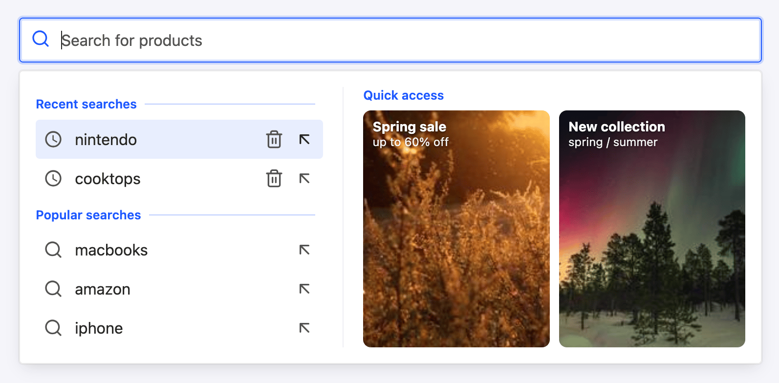
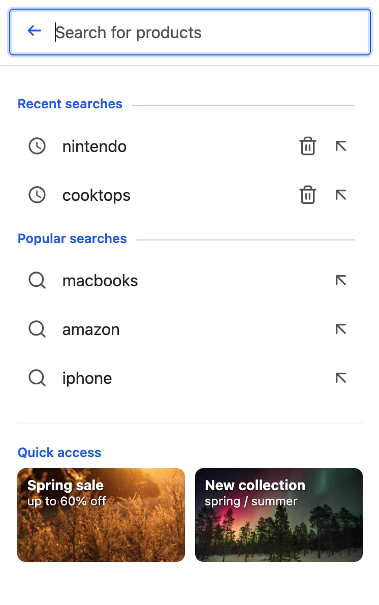
It creates a federated autocomplete experience with recent searches and Query Suggestions on the left, and product previews on the right.
- Desktop
- Mobile
Open CodeSandbox
Run and edit the federated autocomplete example in CodeSandbox.
Explore source code
Browse the source code for the federated autocomplete example on GitHub.
panelComponent arranges the sources into two columns, and each source brings its own header and item components:
React
- Two-column grids
- Product rows
- Shortcut cards
- “See all” and no-results states
Add a shortcuts panel
You can show promotional cards or shortcuts when the query is empty. Define them as static data and render them in thepanelComponent.
When users type a query, show product previews instead:
React
For dynamic cards, return custom data from an Algolia rule.
In the
panelComponent, read the data from results.userData for the products index instead of using a static array.Add a category suggestion
To show a category suggestion in the left column, find the products index and read the top product’scategories from results.hits[0] in the panelComponent.
Guard against a missing or empty categories attribute, then render the category after the suggestions:
React
Show a “See all” link
The index source doesn’t have afooterComponent.
To show a See all link with the total number of matching results,
read the products index’s results.nbHits in the panelComponent and render the link after the product previews:
React
Show the no-results state
When a result source doesn’t have any items, the widget doesn’t render itsitemComponent.
Use the source’s noResultsComponent to show a message such as “No products found”, as shown in the main example.
Combine the empty and typing states
The finalpanelComponent combines two states:
- For an empty query, show recent and popular searches in the left column and shortcut cards in the right column.
- After users enter a query, show Query Suggestions and a category in the left column and product previews in the right column.
- Remove the
headerComponentfromshowQuerySuggestions. - Render the suggestions heading in the
panelComponent. Use “Popular searches” for an empty query and “Suggestions” for a non-empty query. - Show the heading only when the Query Suggestions source has results.
panelComponent, see src/App.jsx.
See also
- Autocomplete guide for the widget basics.
- Rich text box with mentions for a headless pattern with React Hooks.