> ## Documentation Index
> Fetch the complete documentation index at: https://algolia.com/llms.txt
> Use this file to discover all available pages before exploring further.

# Build a mentions text box

> Build a headless social mentions text box with the`useAutocomplete` hook.

export const customLabel_0 = undefined

<div className="not-prose algolia-flavor-switcher">
  <div className="afs-dropdown">
    <div className="afs-trigger" role="button" tabIndex="0" aria-haspopup="listbox">
      <span className="afs-current">React</span>

      <svg className="afs-chevron lucide lucide-chevron-down" width="24" height="24" viewBox="0 0 24 24" fill="none" stroke="currentColor" strokeWidth="2" strokeLinecap="round" strokeLinejoin="round" aria-hidden="true">
        <path d="m6 9 6 6 6-6" />
      </svg>
    </div>

    <ul className="afs-menu" role="listbox">
      <li role="option" aria-selected="false"><a className="afs-option" href="/doc/guides/building-search-ui/ui-and-ux-patterns/autocomplete/examples/mentions/js"><span className="afs-option-name">JavaScript</span><span className="afs-option-lib">InstantSearch.js</span></a></li>
      <li role="option" aria-selected="true"><a className="afs-option is-current" href="/doc/guides/building-search-ui/ui-and-ux-patterns/autocomplete/examples/mentions/react"><span className="afs-option-name">React</span><span className="afs-option-lib">React InstantSearch</span></a></li>
    </ul>
  </div>
</div>

This example builds on the [`<Autocomplete>`](/doc/guides/building-search-ui/ui-and-ux-patterns/autocomplete/react) widget guide.
Use this guide to build a headless mentions text box with the `useAutocomplete` hook.

<Callout icon="flask-conical" color="#14b8a6">
  This widget is **{customLabel_0 || "experimental"}** and is subject to change in minor versions.
</Callout>

## Build a custom UI with `useAutocomplete`

The widget renders its own input and panel.
Use the `useAutocomplete` hook when you need full control over the markup.
It's useful for custom input elements, different panel structures, or inline type-ahead patterns such as `@` mentions.
It gives you the autocomplete state and a `refine` function, leaving all the markup to you:

```jsx React icon=code expandable theme={"system"}
import { useAutocomplete, Highlight } from "react-instantsearch";

function CustomAutocomplete(props) {
  const { indices, currentRefinement, refine } = useAutocomplete(props);
  const hits = indices[0]?.hits ?? [];

  return (
    <div>
      <input
        value={currentRefinement ?? ""}
        onChange={(event) => refine(event.currentTarget.value)}
      />
      <ul>
        {hits.map((hit) => (
          <li key={hit.objectID}>
            <Highlight hit={hit} attribute="name" />
          </li>
        ))}
      </ul>
    </div>
  );
}
```

Render `<CustomAutocomplete>` inside your [`<InstantSearch>`](/doc/api-reference/widgets/instantsearch/react) provider.
Each entry in `indices` has the shape `{ indexName, indexId, hits, results, sendEvent }`.
The hook searches the Algolia indices in your widget tree,
the root index and any nested [`<Index>`](/doc/api-reference/widgets/index-widget/react) components,
so you don't pass index names to the hook.

<Note>
  Because you render the markup, you're responsible for keyboard navigation, active-item state, and ARIA attributes.
  If you need the same accessible combobox behavior without building it yourself, use the [`<Autocomplete>`](/doc/api-reference/widgets/autocomplete/react) widget instead of the hook.
</Note>

## Build a rich text box with mentions

Beyond redirecting to a search page, you can use an autocomplete as a secondary search pattern to improve the typing experience.
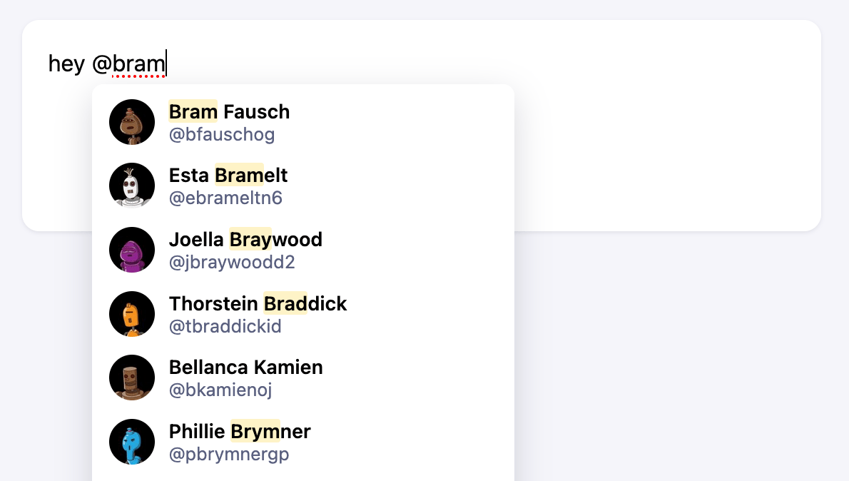
For example, the social media mentions feature lets users mention another user with the "@" character, which opens a panel of matching accounts so you can complete your message with the right username.
The text box provides type-ahead suggestions.
The panel doesn't block users.
They can keep typing and ignore the suggestions, or select one to complete the message.

The compose box doesn't process a query from a search input.
Instead, it parses the content of a text box and detects when you're trying to mention someone.
To replicate this, you need full control over the markup, so you use the `useAutocomplete` hook rather than the widget.

This example searches the public `autocomplete_twitter_accounts` index, whose records include a `name`, a `handle`, and an `image`.
The hook exposes `indices` and `refine`, but not `getSources` or `onSelect` from `autocomplete-core`.
You manage the active token, caret position, and selection in the component's state.

<img src="https://mintcdn.com/algolia/nyJ2KZzw6bfBNB-S/images/autocomplete/widget-mentions.png?fit=max&auto=format&n=nyJ2KZzw6bfBNB-S&q=85&s=9180ac2e6656de0c2d8ee66905dcabaa" alt="A text box that replicates a social media mentions experience: typing &#x22;@&#x22; opens a panel of matching accounts to complete the mention" width="1190" height="674" data-path="images/autocomplete/widget-mentions.png" />

<Columns>
  <Card title="Open CodeSandbox" icon="codesandbox" href="https://codesandbox.io/s/github/algolia/doc-code-samples/tree/master/react-instantsearch/autocomplete-mentions">
    Run and edit the mentions example in CodeSandbox.
  </Card>

  <Card title="Explore source code" icon="github" href="https://github.com/algolia/doc-code-samples/tree/master/react-instantsearch/autocomplete-mentions">
    Browse the source code for the mentions example on GitHub.
  </Card>
</Columns>

### Render the text box

Render a `<textarea>` for the message and, when the panel is open, a `<ul>` for the suggestions.

<Info>
  This example uses a `<textarea>` element instead of an `<input>` for free-form, multiline plain text.
</Info>

```jsx React icon=code theme={"system"}
function Mentions() {
  return (
    <div className="mentions">
      <textarea placeholder="What's happening?" maxLength={280} />
    </div>
  );
}
```

### Detect a mention

If you pass the full text box value to `refine`, Algolia searches the entire message.
You only want to search when the caret sits inside a mention, and you only want to send the mention itself, not the whole message.

To do that, tokenize the text and find the word under the caret, then check whether it's a valid username:

```jsx React icon=code expandable theme={"system"}
// The word under the caret, with its [start, end] range in the text.
function getActiveToken(input, cursor) {
  const re = /\S+/g;
  let match;

  while ((match = re.exec(input))) {
    const [start, end] = [match.index, match.index + match[0].length];

    if (start <= cursor && cursor <= end) {
      return { word: match[0], range: [start, end] };
    }
  }

  return null;
}

// A mention is "@" followed by 1–15 word characters.
const isMention = (word) => /^@\w{1,15}$/.test(word);
```

### Position the panel

When users mention someone, the panel should follow the caret instead of sitting at the bottom of the text box.
To find the caret's pixel position, install [`textarea-caret`](https://www.npmjs.com/package/textarea-caret):

<CodeGroup>
  ```sh npm theme={"system"}
  npm install textarea-caret@3
  ```

  ```sh yarn theme={"system"}
  yarn add textarea-caret@3
  ```
</CodeGroup>

`getCaretCoordinates(textarea, position)` returns the `top`, `left`, and `height` of the caret at a given offset.
Use it to place the panel just below the `@` of the active mention.

### Search for accounts and render the panel

Connect the hook to the text box.
On every input, find the active token.
If it's a mention, call `refine` with the text after `@` and show the matching accounts.
Otherwise, hide the panel.
The hook gives you `indices[0].hits` and a `refine` function.
You manage the remaining behavior, including the active token, panel state, and selection handling.

This excerpt shows the hook wiring. The imports, search client, caret positioning, selection handling, and the panel markup are in [the complete `src/App.jsx`](https://github.com/algolia/doc-code-samples/tree/master/react-instantsearch/autocomplete-mentions/src/App.jsx).

```jsx React icon=code expandable theme={"system"}
function Mentions(props) {
  const { indices, refine } = useAutocomplete(props);
  const inputRef = useRef(null);
  const [value, setValue] = useState("");
  const [activeToken, setActiveToken] = useState(null);

  const hits = indices[0]?.hits ?? [];
  const isOpen = activeToken && isMention(activeToken.word) && hits.length > 0;

  // Only search when the caret sits inside a mention.
  function onInput() {
    const cursor = inputRef.current?.selectionEnd ?? 0;
    const token = getActiveToken(inputRef.current?.value ?? "", cursor);

    setActiveToken(token);

    if (token && isMention(token.word)) {
      refine(token.word.slice(1));
    }
  }

  return (
    <div className="mentions">
      <textarea
        ref={inputRef}
        value={value}
        onChange={(event) => {
          setValue(event.currentTarget.value);
          onInput();
        }}
        onClick={onInput}
        onKeyUp={onInput}
      />
      {/* When `isOpen`, render a panel of `hits` positioned at the caret. */}
    </div>
  );
}
```

When users type `@` followed by a name, highlighted results appear.

### Select an account

The goal of the mention feature is to help users find an account and autocomplete its handle.
For example, when users type a few letters after `@`,
the panel opens with matching accounts.
Selecting an account replaces the typed text with the account's handle, such as "@jwestlakedc", and closes the panel.

When the user picks an account, replace the active token with the correct handle and move the caret after it.
Use `onMouseDown` with `preventDefault` instead of `onClick`.
This keeps focus on the `<textarea>`.

```jsx React icon=code theme={"system"}
function onSelect(hit) {
  const [start, end] = activeToken.range;
  const replacement = `@${hit.handle} `;
  const caretPosition = start + replacement.length;

  setValue(value.slice(0, start) + replacement + value.slice(end));
  setActiveToken(null);
  requestAnimationFrame(() => {
    inputRef.current?.focus();
    inputRef.current?.setSelectionRange(caretPosition, caretPosition);
  });
}
```

### Navigate in the text box

Typing isn't the only action in a text box.
Users can also edit their text or move the caret to a different position.
When the caret lands on a mention, the panel should open.
When it leaves a mention, the panel should close.

Handle `onClick` and `onKeyUp` in addition to `onChange`, and run the same active-token check again:

```jsx React icon=code theme={"system"}
<textarea
  // ...
  onChange={(event) => {
    setValue(event.currentTarget.value);
    onInput();
  }}
  onClick={onInput}
  onKeyUp={onInput}
/>
```

### Add styles

Style the text box, the suggestions panel, and the account rows with your own CSS.
For a complete style sheet, see [`src/App.css`](https://github.com/algolia/doc-code-samples/tree/master/react-instantsearch/autocomplete-mentions/src/App.css).

Users can move the caret through the text, and the panel updates when the caret enters or leaves a mention.
Reuse the same logic to implement hashtags by swapping the `isMention` predicate and the index you search.

## See also

* [`<Autocomplete>`](/doc/api-reference/widgets/autocomplete/react) widget reference for the full list of props.
* [Autocomplete](/doc/guides/building-search-ui/ui-and-ux-patterns/autocomplete/react) guide for the widget basics.
* [Federated two-column autocomplete](/doc/guides/building-search-ui/ui-and-ux-patterns/autocomplete/examples/federated/react) for an example of a widget-based, multi-source panel.