

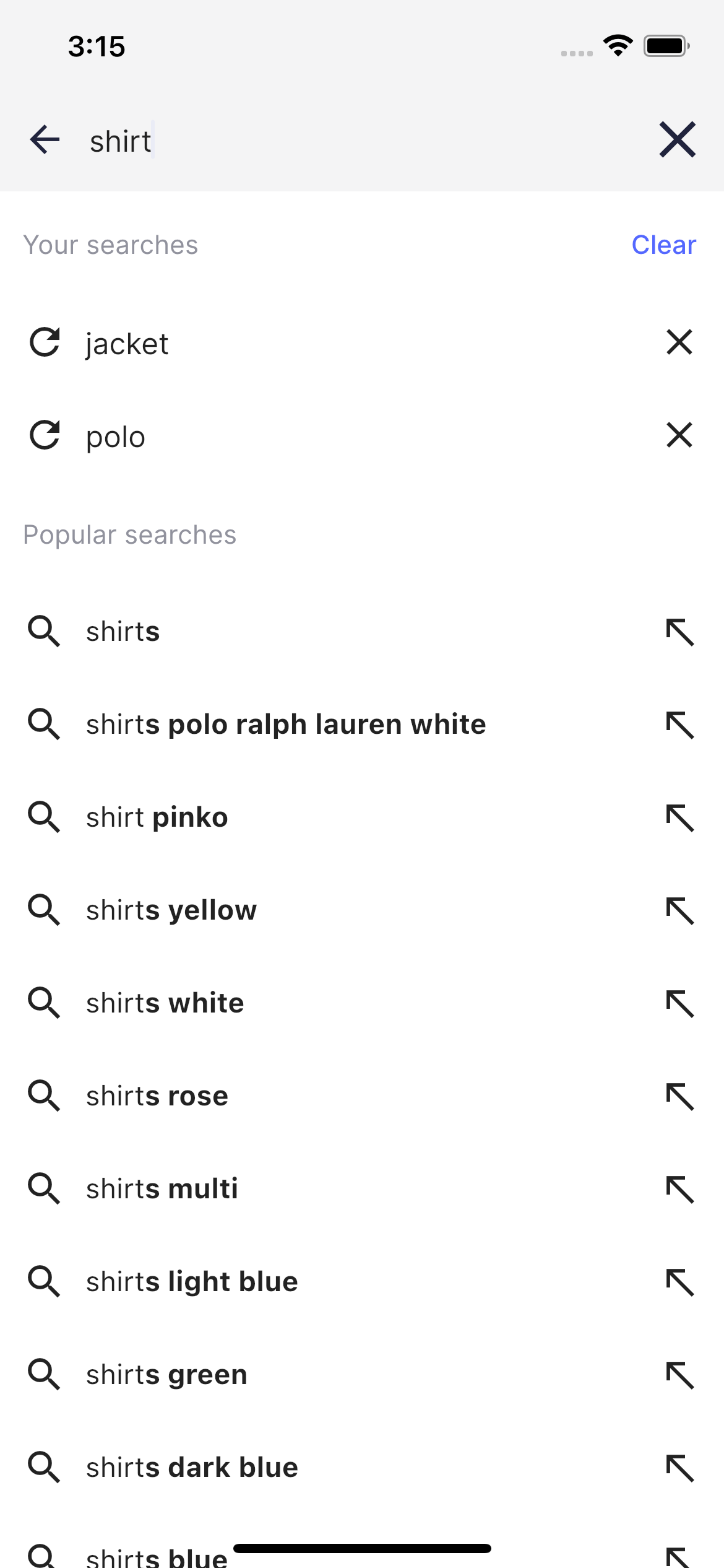
Code summary
TheAutocomplete component is used on the Ecommerce UI demo app search page when you tap the search box in the main page.
It consists of two sections: one presenting the search history and the second one presenting the query suggestions.
The AppBar includes a SearchHeaderView widget representing the search box on the autocomplete screen.
Usage
SliverAppBar and SliverList components representing the section header and section body respectively.
Usage
Search history section
All the submitted search queries are stored in the Autocomplete screen state. Users can delete each history item or remove them all by tapping the corresponding button in the section header.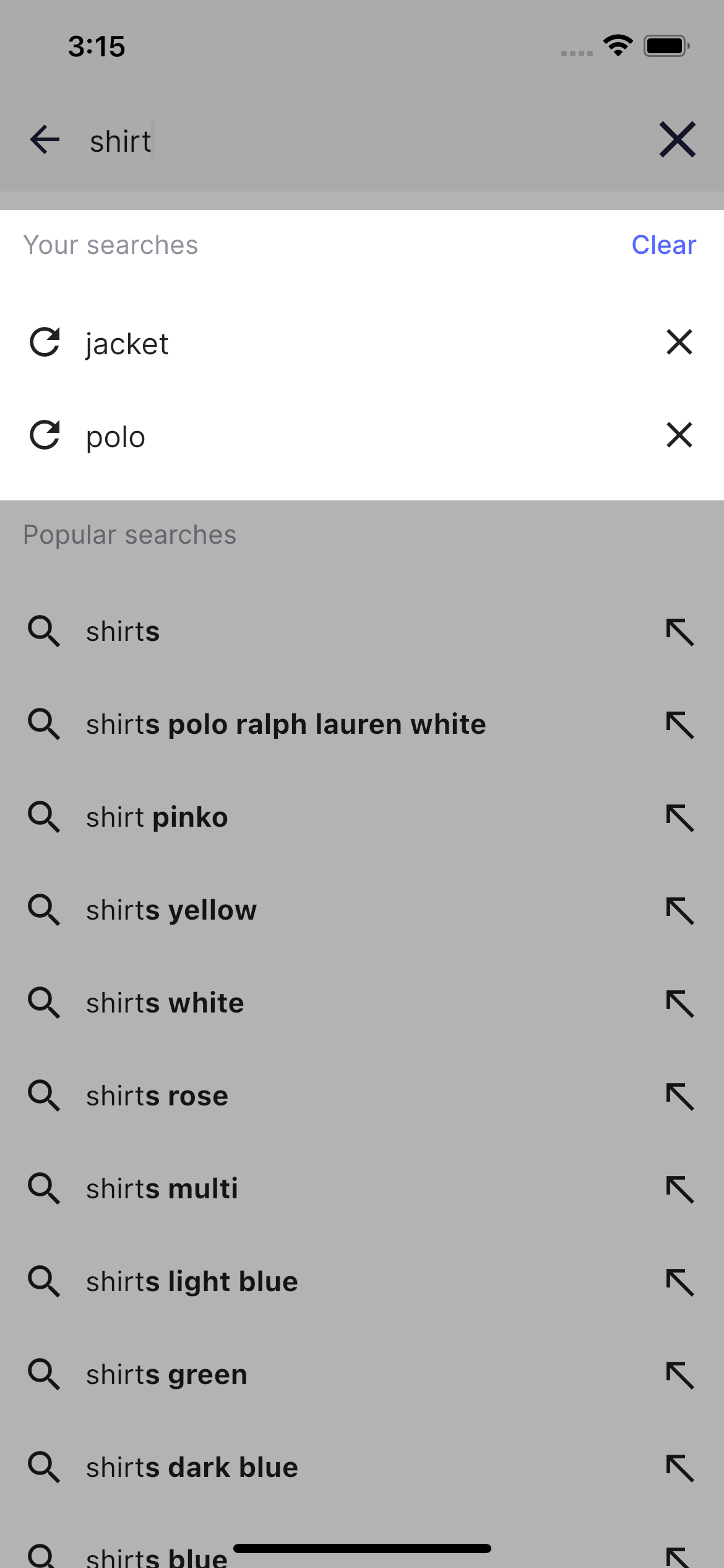
HistoryRowView:
Usage
Query Suggestions section
By default it shows the list of popular searches. When user starts typing a search query the list is refreshing automatically and presents the highlighted search completions.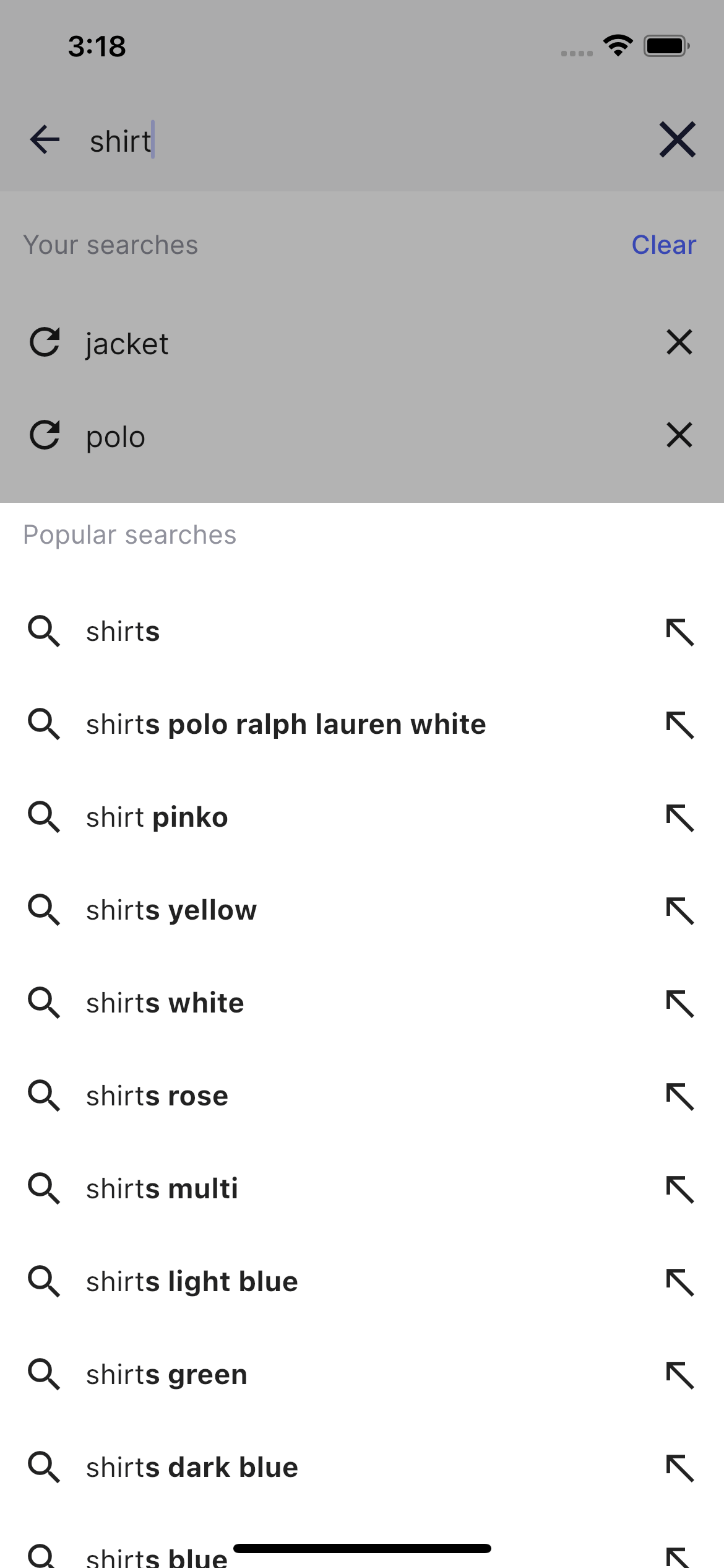
SuggestionRowView:
Usage
HighlightedString.toInlineSpans() from Flutter helpers.
The entire autocomplete logic can be found in the autocomplete_screen file.
You can customize Autocomplete in: