

CSS variables are currently only supported for
chat and autocomplete widgets.Loading themes
InstantSearch.css includes two main themes:satellite.css- A complete theme with modern stylingalgolia.css- Algolia-branded theme
reset.css, a minimal reset theme that provides base styles.
Use a CDN
The themes are available on jsDelivr:HTML
Using npm
JavaScript
Loading individual component styles
If you only need specific components, you can import their styles individually to reduce bundle size. This is currently available forchat and autocomplete components:
JavaScript
JavaScript
Individual component styles include all CSS variables and theming capabilities of the full themes.
You can still customize them using the same CSS variable overrides.
Development tools
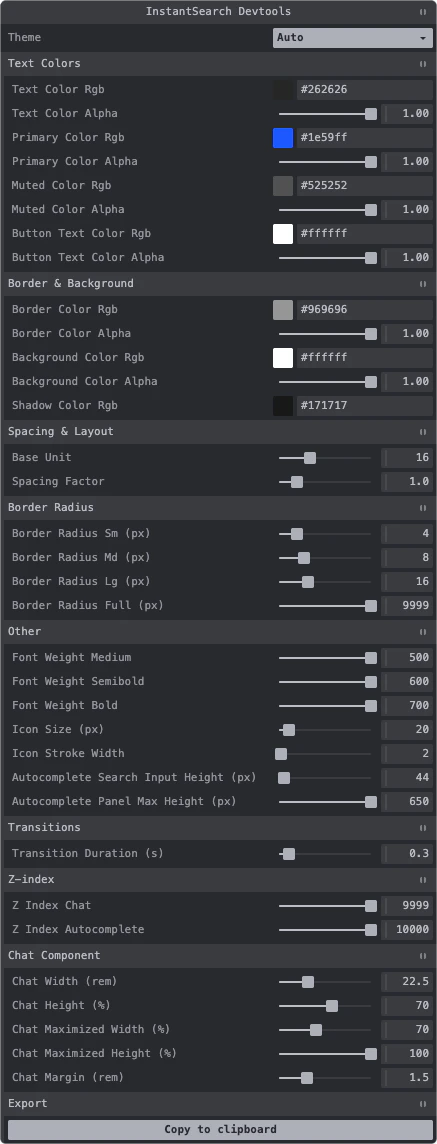
InstantSearch.css provides developer tools that help you customize CSS variables visually in your browser. The developer tools display an interactive panel where you can:- Modify CSS variables in real-time
- Toggle between theme modes (Auto, Light, Dark)
- Export your customized variables to clipboard
Use the developer tools
Import the developer tools in your application:JavaScript
The developer tools are intended for development only.
Don’t include them in your production build.
Programmatic usage
You can also create the developer tools programmatically with custom options:JavaScript
Customization example
You can override any CSS variable to match your brand:CSS
Dark mode
The themes support dark mode in two ways:Using data-theme attribute
HTML
Using CSS class
HTML
CSS
Custom dark mode colors
You can override dark mode colors:CSS