It’s been said that users don’t want to see all the information you have, they just want to see all the information they need right at that point. Even if you haven’t heard that before, it probably tracks with your personal experience. UX design doesn’t necessarily need to be uncluttered, just as sparse as can be while still providing the user with the information they’re looking for.
That said, different users might be looking for different amounts of information, so it’s hard to make a UI that’ll fit everybody. Some users might be more comfortable with taking in lots of information at once, like those who love terminal commands. Other users may feel overwhelmed when presented with excessive text, numbers, and images. Anecdotally, it feels much more likely that a developer would be into dense UIs than your average ecommerce shopper, so someone’s trade or experience with software might impact how comfortable they are with information-dense search interfaces. Even someone’s culture could play into this — there’s a notion among web designers that the sensory overload associated with many public spaces in big cities in China, Korea, and Japan along with the density of their logographic writing systems contributes to them generally being interested in denser websites. This is debated though.
Regardless of why a person likes denser or sparser web interfaces, how can we accommodate them? Here at Algolia, we put a lot of investment into great user experiences, so we’ve got a few expert tips for you.
Progressive disclosure
Progressive disclosure is the idea that we can show the user a smaller bit of information first, and then when its needed, we can show more. This could come in multiple flavors:
- Step-by-step: Showing more information on the next page allows the user to mentally separate the content shown on the first page from the second. This is how most ecommerce search feeds work — the user can see the basic data on the first page in the search results, and then after clicking on the item, they get taken to a brand new page with many more details.
- On request: Some information could be on the same page, but just hidden until requested by the user. A common example of this is accordion dropdowns — the common denominator information that everyone needs is shown plainly, but the excess information is only a click away.
- Based on context: Some information doesn’t need to be displayed at all, depending on who the user is and what they’re doing. Some ecommerce applications already do this with regard to search, removing information that would otherwise be obvious. For example, if you’re searching on the entire website, it might make sense to display a product’s category or rating right in the product card in the search result. However, if the user is on a category-specific page, or they’re filtering by category or rating, that information might be redundant if displayed in the search results.
Taking one or multiple of these approaches reduces the cognitive load on the user, letting them focus on their primary task without distraction. They’ll learn how to use your site with more ease and intuition, and they’re less likely to make errors like misclicks or confusing products for each other. If you haven’t followed this trail to its end yet, here’s why it’s good for you: Less friction equals higher conversions, so your business’ bottom line depends on good UX practice like progressive disclosure.
The next step
Out of the different types of progressive disclosure listed above, you’ll notice that the first and third are the most common in ecommerce. Can we integrate the second idea (to show more information in the same context as the user requests it) into our search results pages?
Let’s do a little experiment. I copied the React Ecommerce demo and added a few lines like these:
const defaultDensityLevel = localStorage.densityLevel ? parseInt(localStorage.densityLevel) : 3;
const [densityLevel, setDensityLevel] = useState(defaultDensityLevel);
const HitContainer = (props) => (
  <Hit {...props} densityLevel={densityLevel} />
);
These lines create a state variable called densityLevel that’ll get passed between the components. It’ll be an integer from 1 to 5, with a reasonable default of 3. So that we can give InstantSearch a Hit component that takes the normal parameters, we’ll just wrap it in a container component that always passes down the input parameters, but includes our new densityLevel variable. If you’re unfamiliar with React, the gist is that any time we call the new setDensityLevel function to set a new value, every component of our site that uses the densityLevel variable will rerender using that new value. So then, we can create a component like this:
const Slider = ({ setDensityLevel, initial }) => (
  <div className="density-slider">
    <label htmlFor="densityLevel">Density Level (1-5):</label>
    <input
      type="range"
      id="densityLevel"
      name="densityLevel"
      min="1"
      max="5"
      step="1"
      value={initial}
      onChange={(e) => {
        setDensityLevel(parseInt(e.target.value))
        localStorage.densityLevel = e.target.value;
      }}
    ></input>
  </div>
);
The Slider component just sets the density level to whatever the user inputted with the HTML range input. Stick that component right next to the search sorting options and now the user has control over the densityLevel variable, with some helpful cacheing in localStorage going on just to make the UX a little nicer.
Now, the question becomes: how do we actually change the UI based on the density level the user set? The first step would be to alter the layout of the whole search results page. To give CSS access to these changes, let’s make our Hits component call look like this:
<Hits
  hitComponent={HitContainer}
  data-density-level={densityLevel}
/>
This is the InstantSearch component that displays all the search results. We’re not only giving it the HitContainer we created before so that each individual hit component has access to the density level, but we’re also setting an attribute on the parent element of all the hits so that CSS can modify the styles based on the user’s preferred density. Rearranging some style rules, we get this:
/* Hits Container */

.ais-Hits-list {
  display: grid;
  --columns: 2; /* this defines density level 1, we get denser with media queries */
  --gap: 20vw;
  --calc-gap: var(--gap);
  --vert-gap: var(--gap);
  grid-template-columns: repeat(var(--columns), calc(
    (100% - ((var(--columns) - 1) * var(--calc-gap))) / var(--columns)
  ));
  row-gap: var(--vert-gap);
  column-gap: var(--gap);
  justify-content: center;
  align-items: stretch;
}

[data-density-level="1"] > .ais-Hits-list {
  --calc-gap: 20vw;
  --gap: 10vw;
}

@media (min-width: 400px) {
  [data-density-level="5"] > .ais-Hits-list {
    --columns: 3;
    --gap: 5vw;
  }
}

@media (min-width: 680px) {
  [data-density-level="4"] > .ais-Hits-list {
    --columns: 3;
    --gap: 5vw;
  }

  [data-density-level="5"] > .ais-Hits-list {
    --columns: 4;
    --gap: 2vw;
  }
}

@media (min-width: 900px) {
  [data-density-level="2"] > .ais-Hits-list,
  [data-density-level="3"] > .ais-Hits-list {
    --columns: 3;
    --gap: 5vw;
  }

  [data-density-level="4"] > .ais-Hits-list {
    --columns: 4;
    --gap: 2vw;
  }

  [data-density-level="5"] > .ais-Hits-list {
    --columns: 5;
    --gap: 0.75vw;
    --vert-gap: 2vw;
  }
}

@media (min-width: 1200px) {
  [data-density-level="3"] > .ais-Hits-list {
    --columns: 4;
    --gap: 2vw;
  }

  [data-density-level="4"] > .ais-Hits-list {
    --columns: 5;
    --gap: 0.75vw;
    --vert-gap: 2vw;
  }

  [data-density-level="5"] > .ais-Hits-list {
    --columns: 6;
    --gap: 0.25vw;
    --vert-gap: 2vw;
  }
}
In plain English: we set a couple CSS variables that control how many columns of search results appear in the final UI, as well as the spacing between those columns. As you can imagine, more columns with less of a gap between them equates to a denser layout. Depending on the screen size and the density level attached to the parent of all the search results, we set different column counts and gap sizes that look right under those conditions.
OK, so now when we change the density slider, the layout can hold more search results in less space. Great! But it doesn’t actually reveal more information, which is what our whole progressive disclosure research was out before. Since we are passing this densityLevel variable down to each individual search result display component, we should have everything in place to do this now, right?
Well, there’s one final consideration first: Remember that information density and progressive disclosure don’t justify redundancy. Duplicate information on the site makes the page more dense with text, but not more dense with information, so it would just be cluttered for the sake of being cluttered. We’re not trying to do that; we want to give the user the power to take in more meaningful information all at once. That means, though, that if a piece of information that would be in our display is no longer meaningful in this particular context, we should replace it with the next most important bit of data. This was type 3 of progressive disclosure mentioned above. In our case, if the user has filtered the search results down on a particular facet like the product’s brand, then they don’t need to see the brand name in every search result. Taking this to the logical next step, if we are going to replace the brand name in the search result with something else that’s meaningful to the user, it definitely shouldn’t be a piece of information that can already be found elsewhere in the search result.
To make this happen, let’s divvy up the space in our search result component into slots like this:
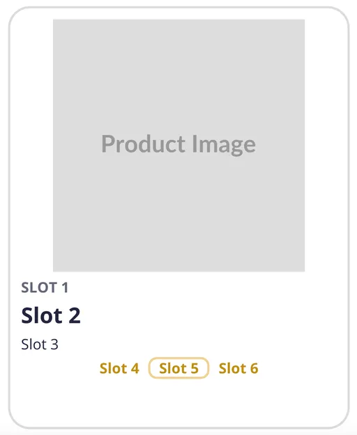
Then, each slot should be filled with a bit of information that follows those rules:
- The data is not clearly inferred by the filters already set on the page
- The data does not already appear in another slot in the search result UI
For every slot then, we’ll run the first check using the data from the useCurrentRefinements hook in InstantSearch, and we’ll keep track of the data we’re filling the slots with from top to bottom to fulfill the second requirement. We’re also able to keep some slots empty to clean up the UI more on less dense settings. I also added in some logic to combine the brand name in with the product title in certain situations just because I thought it looked nicer — something we can’t lose track of with all our formulaic layout logic here. If you’d like to see all this play out in code, I moved it all to its own file here for easy access. The final layout of the Hit component ends up procedurally generated by this function, with some very flexible CSS to make it look pretty.
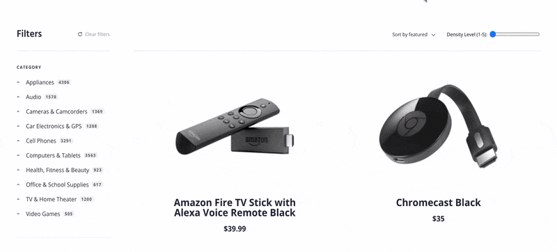
A couple other minor changes were necessary to make this all work smoothly, so if you’d like to recreate this on your own, feel free to lift whatever you’d like from this GitHub repo. Just npm run start to see it work on your own machine. Or, if you’re more of a visual learner, here’s what the final product looks like:
Bring Your Users Into Focus
As we've seen, information density isn't simply about cramming more details onto a page — it's about intelligently displaying what matters most to users in a way they can comfortably process. Whether you implement a density control like the one we've built or not, you're empowering your users to customize their experience based on their preferences when you keep the principles of progressive disclosure front and center in your UI design.


 Other Types


%20(2).svg)

