Estimated time to read: 4 minutes
Where’s a local retailer that stocks the cool item you just found on your Apple iPhone? Where’s a top-notch local sushi bar, according to that “near me” app on your Android?
Searching for things ranging from products to restaurants to news articles on a mobile device is a basic activity for most people: Almost half of the web traffic in the United States (and more than half globally) is generated by people using mobile devices, according to Statista (2021). In addition to being able to find things when they’re out and about, people like using their mobiles to watch movies and videos (via mobile apps Netflix, Tencent, or Amazon Prime from the Apple app store), surf social media, and catch up on email.
Given this enduring reality, it’s imperative that success-focused companies have first-rate mobile apps. They need to provide a fast, smart, easy-to-use search UX and discovery experience.
Let’s be honest…is your mobile app a complete joy to use? Can people instantly find what they need? The way you design your mobile app can make all the difference in getting people to use and stick with it over the long term.
The design challenges of making mobile easy (and fun)
Mobile-search UX design and discovery presents some unique challenges:
- Screens on mobile phones are much smaller than those on desktop and laptop PCs
- Tiny virtual keyboards are tough for human fingers to master
- Mobile connectivity can wax and wane
- Mobile is typically used while not sitting down–walking, driving, taking the subway, wrangling the kids at the park
- A great mobile UX (user experience) requires minimal interaction, but successful Search and Discovery can be complicated
Fortunately, there are proven ways to overcome these challenges and do everything from effectively position your search bar to optimally display your search results.
What makes for A-rated mobile Search and Discovery?
A mobile app designer’s mission comes down to three tasks: applying solid design concepts, ensuring excellent usability, and accommodating spotty connectivity. All of this must be determined while taking into account:
- The size and complexity of your data set
- The amount of knowledge users are expected to have about what they’re seeking
- How much to emphasize intent (looking for something specific) vs. how much to emphasize discovery (browsing and open to ideas) in the search experience
If you’re looking to create an outstanding user experience on a mobile device, there are various ways to nail it. Here are some industry experts’ secrets on creating a mobile Search and Discovery experience that rocks your users’ worlds, which can undoubtedly increase your conversion rate and kick your business up a notch.
Small on space, big on usability
With mobile, the #1 rule for displaying search results and data is “Less is more.” You want an easy-to-use design and layout for a small screen.
People should be able to quickly search for, find, and, if they’re in an eCommerce mobile app, buy an item using a small screen. You want to provide relevant content that doesn’t overwhelm people or require them to keep refining their search. You need the right nuggets of information with minimal text. It should be simple for users to access a second page of search results. And for content discovery that doesn’t necessarily require a search box, or that helps refine a search, your selection tools, such as toggles and sliders, should be intuitive.
A “just right” search bar
Some mobile apps work best when users automatically start with a search bar, while in others, the open-ended nature of the content, such as with media content, makes browsing the most effective approach.
According to Denmark-based web UX research organization Baymard Institute, search bar size, placement, and level of contrast help establish how strongly searching is the “recommended” method of finding something. If search is relatively crucial, such as in an eCommerce app (studies show that shoppers who start by searching tend to convert better), a search bar is the right choice. If search is more optional, you can tone down its emphasis by substituting a clickable contextual search icon.
The right search-transition screen
The next UI element to optimize is the search-transition screen—what users see before their search results show up. Design options:
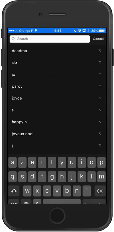
- Recent searches: When a user searches for a product, they see previous searches for comparison or as a reminder, as in the RetailMeNot app below.
- Trending: They’re shown what other users typically want. This can help a casual shopper discover interesting items.
- Categories: They’re shown category filters.

- Instant results: Results dynamically appear with each keystroke (below). This design is most effective when the data set is smaller or the user has a more definitive idea of what they want. For instance, in the Spotify app, searching is limited to albums, songs, etc., so query suggestions would mostly seem like overkill. Users can always dive into a category by clicking “Show more.”
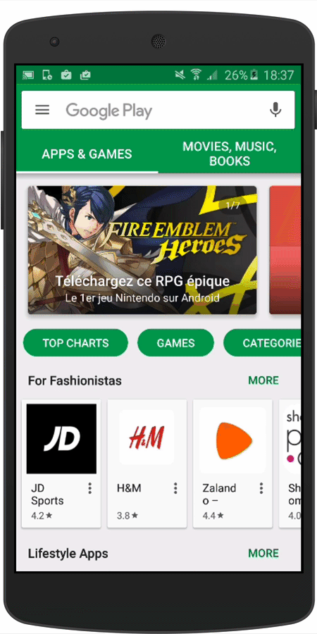
- Query suggestions and instant results: This works well if you have a large dataset and want to guide users with suggestions, and you can confidently determine whether a good match has occurred. The Google Play app store (below) inserts instant results above query suggestions.
Automatically included autocomplete
Autocomplete suggests search queries as a user is entering search terms; when the phrase they want appears, they can simply tap it.
In Mobile Design Pattern Gallery (2014), Theresa Neil cites the importance of integrated autocompletion in enhancing mobile searching. If your autocomplete feature can also visually differentiate the mobile search engine’s suggestions, for example, by bolding the suggested terms being added to the user’s phrases, that’s even better.
An Rx for mobile typos
Who hasn’t gotten annoyed by seeing that they just entered typo-riddled nonsense and gotten no results?
You can help users stay calm by using typo tolerance to guess user intent and catch text-entry and typing and spelling mistakes in real time as people enter queries:

Search as you type and query suggestions
You can anticipate what users want and provide search-as-you-type results, as well as help them figure out more specifically what they want by offering search query suggestions.
With query suggestions, which work well to drill down in large data sets, users don’t instantly see results as they’re typing; they’re instead shown popular or relevant queries. For example, if they enter “iPhone,” (below) the suggestions include phrases like “iPhone charger.”

Results refining
If necessary, people using your app should be able to easily fine-tune their search results. You can make this happen by placing the search field containing the person’s entered query above their generated search results.
Intuitive filtering
You can use faceted search to maximize small-screen real estate, letting searchers narrow their results by applying filters, typically by selecting options provided in a “tray”-style overlay.
Faceted search is popular with eCommerce retailers (and the mobile equivalent, m-commerce) and travel service providers, as well as in online search tools on media websites.
A consistently error-free experience
Professionalism goes a long way toward making an app user friendly, and one aspect of that is consistency. You don’t want users wondering why the search interface seems half baked; you want them to love seamlessly finding what they need.
Along these lines, the search bar should live in the same spot on every page in your app. And touch gestures used for things like expanding a map or scrolling through search results should operate the same way every time.
Do some in-depth QA on your app before you release it.
The latest technology
A cool new way of skipping tiny-screen frustration is searching by voice. In 2019, according to eMarketer, 40% of all U.S. Internet users were speaking queries on their mobile devices, so it might make sense for your app to include voice as a search option.
A personalized shopping experience
You can use AI tools that gather information from users to create eCommerce search tailored to your users’ needs. Only 1 in 8 online retailers are doing this, even though it can substantially increase conversion. For instance, based on what shoppers have already searched for, you can offer them recommendations for similar or complementary items, or refer them to local retailers’ brick-and-mortar stores where they could immediately pick up the item.
The mobile search results page: best practices
Hooray! Your user has some search results to look at. And now you’ll want to make sure everything is hunky dory here, too.
Be fast
A good search experience must meet mobile users’ expectations of speediness. We’re all spoiled by ultra-high speed Google search. If you’re like most mobile users, you won’t tolerate a search that takes forever; you’ll just leave the app. And that’s a big problem: according to Inc., search abandonment costs eCommerce companies $300 billion a year.
How can you ensure speed? With the right tools.
Display results based on product type
How do your users want to view items? For products such as a pair of shoes or clothing, a photo is worth a thousand words.

If it makes more sense for you to emphasize specifications than photos, such as with restaurants, you can display details such as the type of food, price range, ratings, and distance along with a small picture.
Use filtering to cut screen clutter
In advanced search, filtering options are imperative in order to avoid cluttering the screen. You can use a scrolling filter bar, as Amazon does below, which accommodates an impressive number of filtering options:

A good filtering tool also “responds” when the user applies a filter. For example, the Airbnb app has a button at the bottom that informs the user of the number of search results when a filter is edited:

Show only the most-relevant results
Because of the limited space on mobile devices, only the top search results are visible, so they’d better be relevant. You can evaluate your relevance by taking into consideration both textual and business ranking rules.
Encourage scanning
Most people on the move want to be able to quickly scan their search results. Highlighting, which helps people understand why they’ve gotten their particular results, is an effective way to allow scanning.
Standard highlighting, applied to exact matches of the query, works well when displaying instant search results:

Inverted highlighting calls out everything but the search query, making it easy to identify differences between suggestions. An excellent scenario for applying this is with query suggestions:

Anticipate poor connectivity
Network coverage is rarely perfect for mobile users–a fact mobile app design must take into account. The mobile search experience still has to be smooth. One way to let users know that their information will load ASAP is by providing a mobile search engine progress indicator, such as a ticking clock icon or progress bar.
Another way is to use a skeleton screen with placeholders:

A third idea is to use lazy loading, which prioritizes certain content and fetches the rest a little at a time as needed.
The future is mobile
Mobile search is a dynamic field that’s continually changing as new technology, such as the ability to make AI-related recommendations and personalize the shopping experience in an eCommerce app, become available.
An effective mobile search app is an inherently powerful thing. By optimizing your mobile experience, you can improve your conversion rates and reduce your bounce rate, all without sacrificing content relevancy or integrity. While many companies have yet to optimize their mobile search apps, as they do, and as their users are delighted, mobile search is sure to become an even more enjoyable activity, as well as a profitable one for businesses.
Contact us at Algolia today so we can help you set up an amazing mobile user experience.


 Other Types


%20(2).svg)